To preface my review of the James River exhibit at Maymont, I offer this insight into my personality: I am critical. I value criticism because, without understanding what is wrong and what is right, one cannot evaluate how successful something was executed. There are many aspects of the exhibit that were enjoyable, while other parts needed rethinking in my opinion. Overall, the James River exhibit caters successfully to kids, but not to older people (middle school and up) and I think this is a partial mistake. The people with the agency to enact change in and around the James River are more likely teenagers and adults. Therefore, centering an exhibit explicitly around children may only scratch the surface in terms of encouraging the masses to change behaviors.
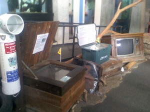
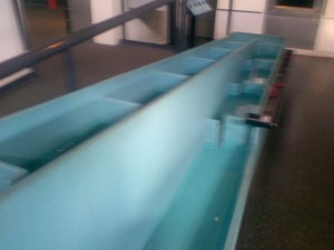
What about the exhibit did I like? The animal tanks with fish and turtles certainly catch the attention of anyone who goes by. Children will be fascinated by what is lurking beneath the river they see everyday. Thoughtful adults may see the animals and think. “I can to help protect these animals.” An adult with a kid of their own might even think, “If I help the James, I help my child, these animals, and my child’s ability to see these animals in the future.” The interactive fish ladder is also helpful for all ages as it shows one way humans have accommodated animals after humans constructed dams and changed water flow. A final aspect of the exhibit that I felt opened up discussion for all age groups was the trash display. An entire middle section of the exhibit was devoted to showing real-life models of commonly found river litter. Any child can easily connect that litter is bad, so they should make sure not to litter. For me, the display made me wonder how to help develop ways to limit litter around the river since I have the capability to make community-wide change.

This part of the exhibit showcases kinds of trash we leave that hurt the environment. A good visual for people of all ages.
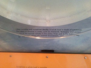
What made the exhibit inaccessible to adults? Some of the labels to the exhibits were only at six-year-old eye level. I had to fully stoop down to read the description of different pollutant loads that affect the river. In addition, type was small! Even at 19, I need glasses, so the small fonts impacted my ability to enjoy the exhibit a little. Finally, one of the parts of the exhibit was closed for construction. This is a bummer for everyone, but is understandable. Hopefully, that part will be back open the next time I go to Maymont!
One of the most helpful parts of a critique is not identifying what needs improvement – it is suggesting HOW to improve those things. To make this exhibit more functional for a range of ages, I believe texts should be visible from a range of heights. Another change to make is adding a few elements to specifically attract adults into positively interacting with the James since they have more of an ability to travel and volunteer. Maybe a pamphlet with different community activities and volunteering projects would steer people towards the river. Perhaps a display of these activities and volunteer projects would do the trick. Either way, educating can only do so much. People want convenient access to projects (if they want access at all) and the James River exhibit would be a prime place to showcase all the options available.
Outside of the exhibit, Maymont is gorgeous. I was very impressed by the greenscaping, especially the grasses buffering water systems! I cannot wait to go back with friends.


Great opening sentence. Third week in a row where I have read the first sentence of your essays and wanted to jump right in to see where it would take me. The conclusion of this essay tapers off a bit instead of ending with a bang. The last paragraph would be better placed as a postscript, and the paragraph before that would benefit from a couple of wrap-up sentences as memorable as your opening sentences. Otherwise, the essay is well organized around the central theme presented at the end of the first paragraph that a successful exhibit targets multiple audiences not just children. Is there additional support for this thesis that the essay could reference (hyperlink to)? For example, studies demonstrating the value of targeting diverse audiences, examples of presentations that are more successful in accomplishing this goal… Nice use of photos to support points made in the text. The captions provide a useful summary and help to make the link between images and text.