
I found this podcast very interesting because at first when I saw this week’s topic was about statistics, I was confused as to the role stats play in humanities. I had never actually considered how graphs we see regularly can be skewed or strategically misrepresented to falsely depict information. While statistics are supposed to be a tool for proving theories and providing insights, the display of these same statistics can be a tool of manipulation.
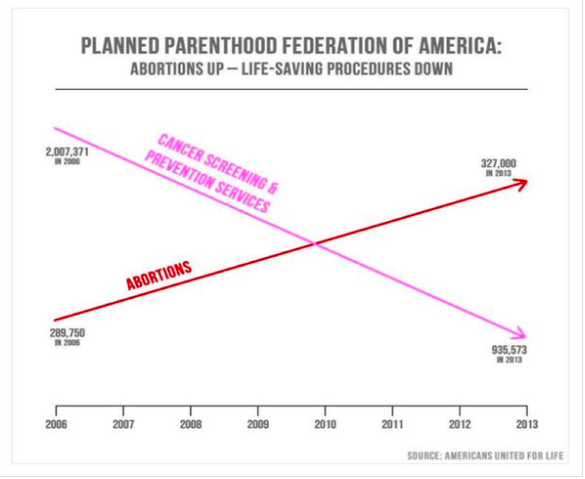
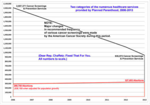
I found this one graph, which was presented at a Congressional committee hearing in 2014. Not surprisingly, this graph was made by anti abortion advocators in attempts to defund Planned Parenthood. They are trying to show that Planned Parenthood has offered less and less cancer/health services and more abortions. This graph was meant to disprove the many supporters of Planned Parenthood who argue that the organization offers essential health services to women other than abortions. I find it interesting that this graph has no y-axis, so if you look at the actual numbers, the placement of the lines makes very little sense. Also, the fact that the lines intersect is bizarre. Political/social bias is often extremely prevalent when information is displayed to the public. Obviously, this graph is misleading. I am also going to include a second graph I found on the same website that more accurately displays the information. It includes a y axis and explanations, which greatly help in displaying the information more accurately. These two graphs give off two completely different messages. Absurd. This may be insignificant, but I also noticed the colors of the graph show bias. The cancer screening and prevention services line is in pink, which is globally recognized as a positive symbol of health awareness. The red line for abortions, to me, signifies that abortion is a bad thing (the color red has many negative connotations, including wrong, stop, and blood).
https://huntercollegeqr.wordpress.com/activity-planned-parenthood-misleading-graph/
Loved your post Kate! I agree- Anti-choice movements have some of the ickiest practices in terms of misleading the public. They tend to have a knack for displaying information in the post appealing way possible, or just making up numbers if they don’t exist! As for the charts themselves, I found it interesting that the simplicity of the chart is something I feel like we see quite often in mainstream media. I have definitely seen a similar attempt at skewing data by other movements (Mainly racist claims about crime rates and the relation to POC communities) and it proves quite effective. We need to be more critical of our info!
I definitely agree. I would say that with all issues, on both sides of the argument, people often create graphs and trends to justify their position. I see this often on IG where people repost random graphs to persuade people to agree on a specific position. Often this is done unintentionally, but the practice of it is without a doubt affecting people’s perceptions on important issues.
This is a great example of the alteration of an image to inaccurately represent data. It’s amazing how much you can do just by drawing lines out of scale. Also, the red line catches your eye immediately. I think most people who see this image will gravitate toward the shape of the lines, and they might not even notice the missing scale on the Y axis.
I think this is a really important phenomenon to understand. This type of misleading information is actually used to inform policy, which I think is ridiculous. There is no sense in it, yet it is compelling. Without actually looking at or understanding graphs, the top one tells a very different story from the real data. We need to ensure that all graphs we take into account when making big decisions, especially in government, are accurate.