
This is currently one of the graphics or charts I find most interesting. I have seen it circulating again recently, a little over a year after it came out. The reason I find it so interesting and that it is one of my favorite charts right now is because of how inaccurate it has proved to be in the past year since the covid-19 pandemic began. It combined a visual map and a bar chart below, and details the level of preparation of some countries on the bar chart, with the map showing all territories and countries. This graphic does not explain the criteria used to determine a country’s preparedness for an epidemic or pandemic, however, just from a glance there are some potential trends visible in what countries were determined to be the most or the least prepared. Many of the countries who were deemed the most prepared are countries that are considered “developed” countries, and countries that are sometimes called “underdeveloped” were deemed the least prepared. This graphic also seems very euro-centric as to which countries were determined to be most prepared. Additionally, although the map attempts to show all territories and countries, only certain countries appear on the bar chart with a numerical value assigned to its preparedness. I think this graph is interesting because it reminds me to question both what factors were considered in making an evaluation, as well as what factors or biases might influences how and what parts of the data are presented in a chart or graphic.
Source: https://www.statista.com/chart/20629/ability-to-respond-to-an-epidemic-or-pandemic/
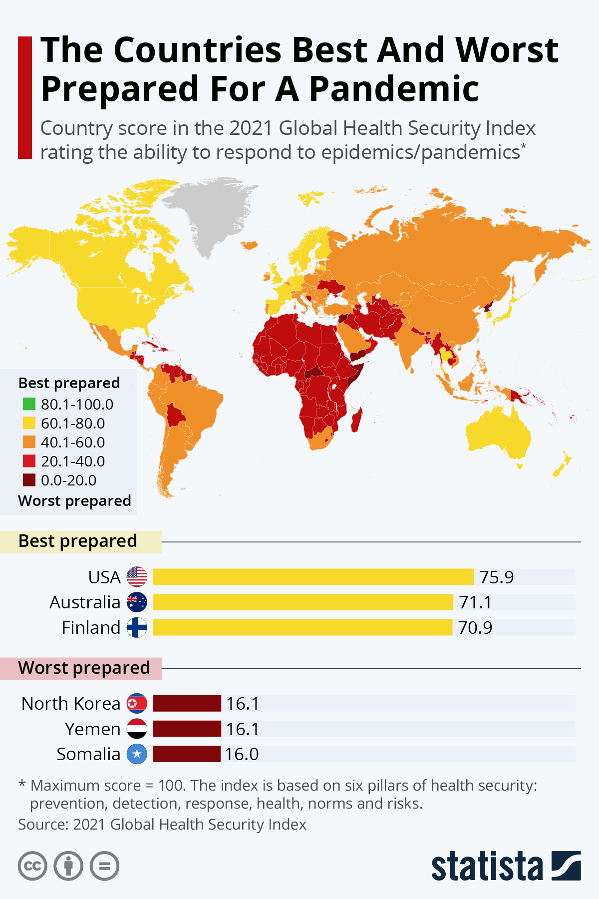
I think global color-coded maps such as these are definitely some of the most misleading and misinterpreted data visualizations. I used one that displayed the “happiness” of each country by color. These maps so often times lack information and background that people take it at face value and fail to see deeper into what these maps are actually representing, where the data is actually coming from.
I think a good point that that you made is what is the determinant for being the best or worst prepared for the pandemic. I think it would be very easy to argue that the US was not very prepared for pandemic or at least the top of the list for most prepared. I would be more interested to know who made this graphic and what data they collected for it. Additionally I would want to know exactly when in 2019 this was created because they would possible change which countries were deemed the most prepared.