Graphics showing the Impossibility of M.A.D.
As an aspiring designer, I love the ability of infographics to convey information in countless contexts. There are many great TED talks on the power of these graphics, as well as a few big data companies that focus solely on portraying big data in this style.
Even Buzzfeed utilizes infographics to convey topics of IR that portray information in new and exciting ways. http://www.buzzfeed.com/tomchivers/bhutan-loves-its-archery-apparently?bffbmain&utm_term=4ldqpgp#.cbX1GRadb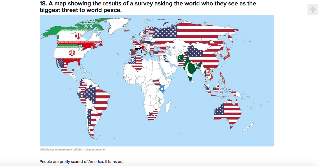
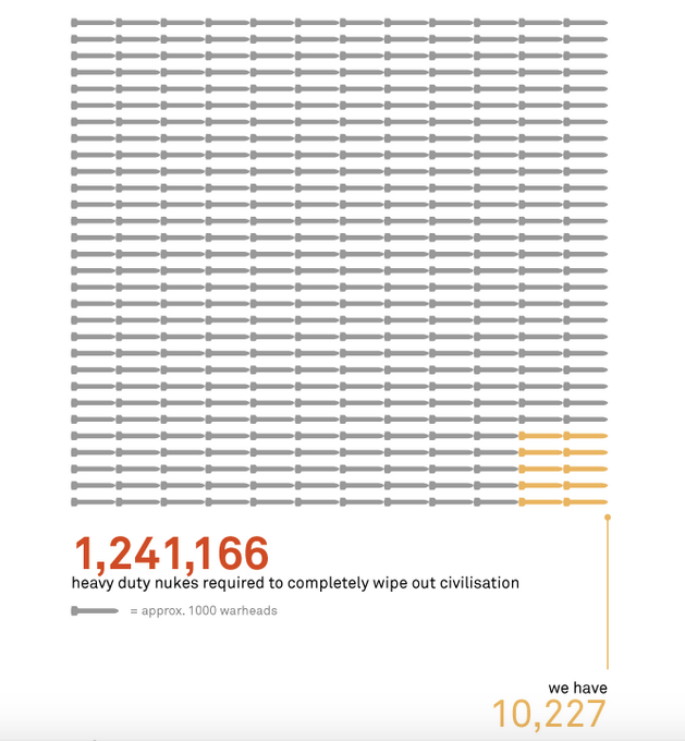
One of these companies of big data, Information is Beautiful, released an article in 2009 on the power of nuclear bombs in the modern era, and (despite the popular notion) how one bomb cannot instantly bring an end to the world. http://www.informationisbeautiful.net/2009/how-i-learnt-to-stop-worrying-and-love-the-bomb/
One key graphic to pull your attention to:
After a quick search, I found yet another infographic on the current stockpiles of nuclear weapons around the world, with an ability to isolate each major country to see their reported numbers. http://thebulletin.org/nuclear-notebook-multimedia
While infographics are powerful tools to convey data, the results are still just that – just data. There is still room for interpretation about these results. Leave comments below to share your thoughts!