
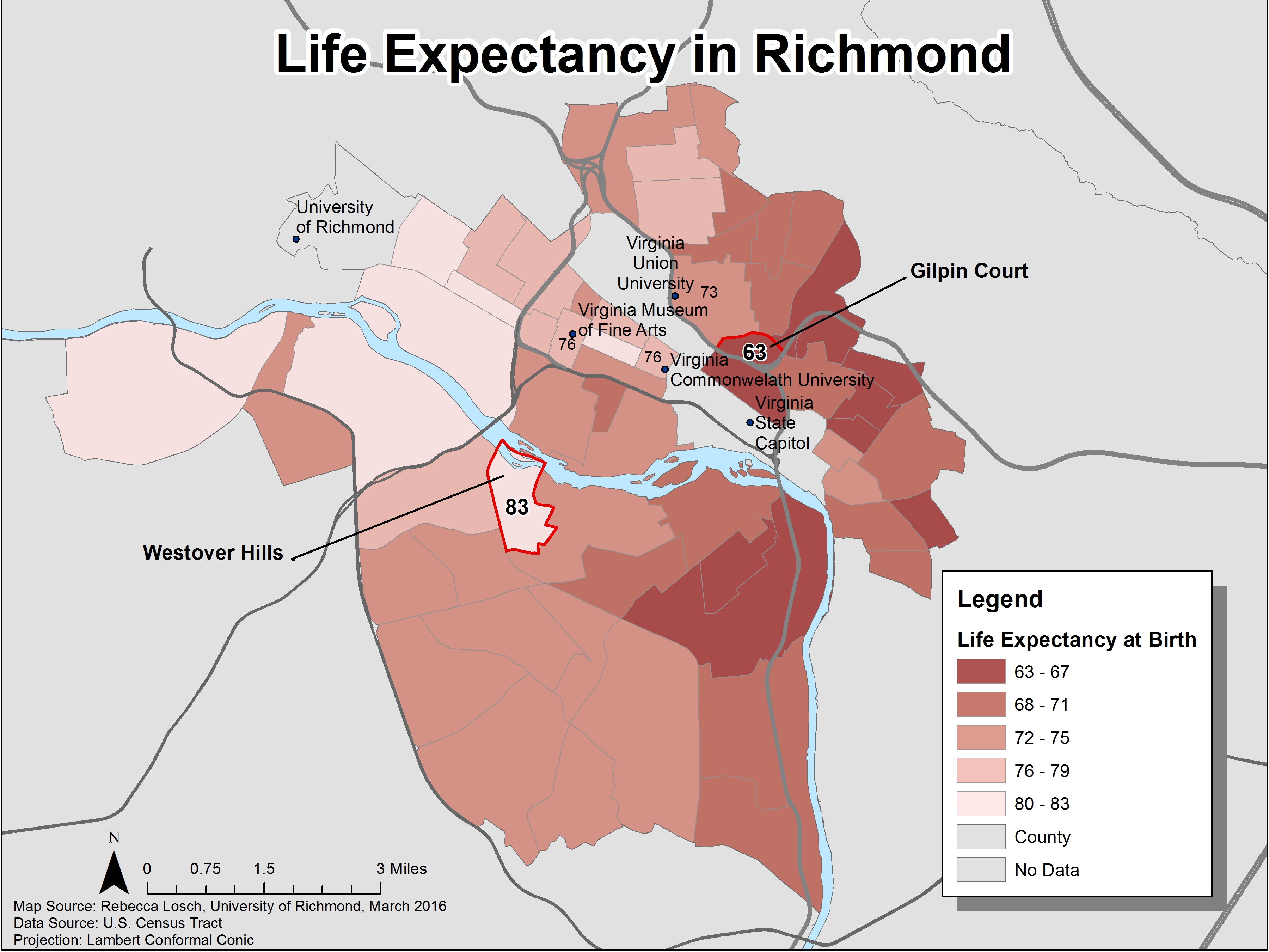
This map aims to highlight the disparity of life expectancy within a 5 mile radius of Richmond. The legend shows the overall averages of each county within Richmond, with red being the shortest life spans because it stands out. However, I wanted to show the exact life expectancies in areas that many Richmond students would recognize, and especially highlight the greatest and lowest life expectancy towns. “The standout spot is Gilpin Court, a large public housing project, where life expectancy is just 63, on par with Haiti.” A few Universities, the James River, and main roads were also added to this map to give it context and help the reader easily identify areas. My hope is that this map helps to facilitate conversation about why there is such a gap in life expectancy, the various factors that influence life expectancies, and how to address those factors.