
http://https://thesocietypages.org/socimages/files/2014/04/120.jpg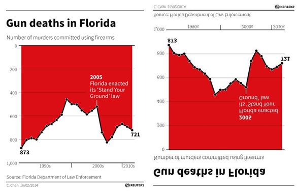
This is my favorite misleading chart because of just how absurd it is. In theory, charts and graphs make things easier to understand. Clearly, this is not always the case. This graph, conveniently labeled “Gun Deaths in Florida,” is just so misleading. First, and most obvious, it is upside down to how we typically read graphs, with the zero at the top of the graph. This situates it so that the most deaths are lowest on the graph. At first glance, it seems that death decreased after the Florida “Stand Your Ground” Law was enacted, and that total gun death have decreased since the 2000s. This is incorrect. Gun death actually dramatically increased after 2005. Despite the y-axis being flipped, the numbers are labeled fairly clearly. However, the x-axis could use a few more ticks on the axis bar to show exactly when the graph ends. The filled-in red just makes it more confusing overall as well. To make matters worse, this graph was not created by someone who was unfamiliar with graphing practices, or who was selling a product. It was instead from the Florida Department of Law Enforcement itself!
I was lucky in that I learned how to interpret graphs and charts in middle and high school, and so was quickly able to recognize the misleading aspects of this graph. However, this is a pretty obvious example. I can think of plenty of other graphs that are misleading, either on purpose to hint at a particular interpretation of data, or on accident in an effort to make the graph more aesthetic or fit on a page. I’ve even seen graphs with no labels or tick marks in magazines and popular media. Meanwhile, statistics are even more easily manipulated. The most common instance of this in popular media that I’ve seen are polling surveys, especially when they do not include their margin of error.
This is very interesting to me as I have never interpreted an upside down graph. The most concerning part is where the graph came from. If the sources that we trust are misleading us with numbers and information, what else are they misleading us with?
This graph greatly surprised me, because upon first glance it conveys a significantly different picture than reality, but few people would take the opportunity to take a second glance at the Y axis in order to confirm the picture it presents. It was concerning to me to see that it was published by a government agency, because it is clearly designed to mislead or misrepresent the actual number of gun deaths in order to gain support for gun ownership.