
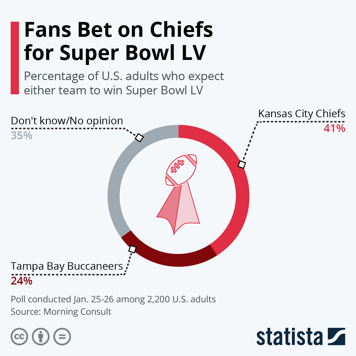
Before this class, I thought this chart regarding fans betting on the 2021 Bucs and Chiefs Superbowl was helpful. The part I loved was how 76% of the people didn’t care or thought the Chiefs were going to win the game, and Brady and the Bucs came out on top. However, the podcast taught me that you need to look deeper into where the material is coming from and the sample size of the data used. The poll us sourced by a reliable place, but with only 2,200 U.S adults as the sample size, that raises some flags (you probably don’t get it, but each time the Bucs win, we raise the flags, so that was supposed to be a little funny). They do not say how the sample was taken (randomized) or just people who wanted to respond. That will have a huge impact on the data. Also, generalizing to the entire U.S population could have been a stretch since the US comprises 332 million people… So we just need to be careful when looking at graphics because the numbers can be quite confusing and significantly off if not calculated correctly.
Sports polls are definitely something that can be looked really deep into because no matter what they polls say, the results can always be different. I think the age of people who they surveyed as well as where they came from like you stated could definitely impact the poll. Overall even the polls that seemed to be sourced well can still be evaluated and looked more into.
I agree that a lot of graphs/data can and should be examined and looked into it because a lot of them probably generalize to an entire population when the sample size is not that large. This is dangerous if generalizations occur like it did in your graph because the information becomes misleading and if people do not look closely, they will be reading/believing incorrect or inaccurate data.