http://www.tylervigen.com/view_correlation?id=7
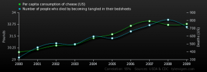
As I was listening to this podcast and reading the article, I couldn’t help but think about this chart that I saw in my Quantitative social science class last week. We were discussing the difference between causation and correlation, and like the podcast briefly mentioned with the Nicholas Cage vs swimming pool drownings connection, one does not necessarily cause the other; it can just be a crazy coincidence. When I first saw this chart, I couldn’t believe it. How could it be possible that the consumption of cheese was in any way correlated to dying by being tangled in bed sheets? I didn’t even know that people died that way, let alone hundreds of people and enough people to collect data on it. Then, my teacher explained that these two sets of data in fact have nothing to do with each other, and neither caused the other to happen, there are just two sets of statistics that happen to have an almost identical progression. Therefore, this chart is extremely mis-leading. For someone who hasn’t been educated on the proper ways to read and analyze information, whether its numbers or writing, could be extremely mislead by this chart if they took this chart at face value. If someone saw this on the news, they could freak out and never eat cheese again! Just like Lindsey, I am glad to be taking both critical thinking and quantitative social science at Jepson to learn how to evaluate things we see in our everyday life.


We recently looked at a similar chart in my quantitative social sciences class as well! The chart showed the consumption of ice to positively correlate to the number of drownings. This was used to explain confounding, when another variable, such as warmer weather in summer, impacted both how much ice cream people are eating, and how much people are going swimming, therefore increasing the possibility of drowning. It is crazy was kind of connections can be drawn if the connections, correlation, and causation of the variables are not considered or effectively analyzed!
I am also taking quantitative social analysis, the same class as Sophia, and we have discussed a lot about how misleading most infographics are, but they are increasingly gaining popularity. I can’t believe someone even thought to make a chart like this — if I had seen this on the news I would definitely be freaked out.