
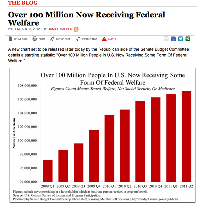
This is a graph from USA today that makes it look like the numbers of people receiving Federal Welfare is getting out of control as each quarter continues. It is extremely misleading as the Y-axis begins at 94,000,000. The graph did not just reach nearly 108,000,000 overnight, but instead has slowly grown from 96,000,000 in 2009.
It is very easy to see how different news outlets leaning left or right can put their own opinion onto statistics in order to mislead the public on things like policies to the growth of the economy. This is definitely where you can begin to see political parties widen the gap and become more polarized as the truth gets twisted towards their view and therefore limits the number of moderates. As a business major, I can certainly see how people could use misleading graphs in order to portray the economy or the success of a business a certain way – potentially in an attempt to influence economic policy or the way people invest overall. It just certainly makes you question what you are reading and only further shows the importance of varying the sources that you are getting your information from along with checking/fully examining what is in front of you.
This is a great example of manipulation that is not outright lying, but definitely can mislead people and bring them to the wrong conclusion. Representations of Covid data does this sometimes, especially because we’re so primed to expect bad news.
This is interesting to look at as it is common to not look at the numbers on the graph but the trends. Just the increase in numbers is concerning but when you explain where the numbers start, it makes more sense. I think in general, the representation of a large increase in any graph is scary for many people.