GIS Day 2013 Preview

GIS Day 2013The Spatial Analysis Lab is excited to host our seventh-annual GIS Day, this Wednesday, November 13, in the SAL from 10:00am to 5:00pm. We have detailed information about the event on our GIS Day page. In addition, you can find more information by following us on Twitter and attending the Facebook event.

For now, however, we want to give you a preview of all the exciting events that will take place this Wednesday, as well as some of the activities that will be happening all day long for our open house.

Events
For a full schedule of events, see the GIS Day page.

  • Guest speakers: Highlights include talks from four UR alumni, current professors, and current students.
  • Our annual geography-themed cake contest! Submit a cake (or any other similar baked goods) to the Spatial Analysis lab by noon on Wednesday. The cakes will be judged based on originality and connection to geography and/or GIS. Prizes are available for the winners!
  • Geography fun and games: Join us for lunch. Rumor is there will be a t-shirt giveaway, a Twitter quiz, and perhaps some other exciting games…

Other Activities
These will go throughout the day, so feel free to stop by the SAL from 10:00am through 5:00pm, sit down at one of our computers, and have fun!

  • “Ask a GIS Expert”: If you have any GIS-related question, our team of professors, staff, and interns will be on hand to help. There’s no question too big or too small that they won’t answer. This is also a perfect way to learn about the GIS capabilities at UR, the data sets we already have, and how you can use GIS in your classes, work, or research.
  • Hands-on GIS for Desktop: Esri, the company that creates the ArcGIS products and sponsors the international GIS Day, has generously supplied some pre-made lessons that guide you through a real-life GIS analysis! This is a great way to learn about GIS, and no prior experience is required. All you have to do is follow easy, step-by-step instructions. The lessons include determining appropriate lynx habitat sites and mapping major features on the surface of Mars.
  • Hands-on GIS Online: Esri has also prepared some fun geo treasure hunts. Use your geographic knowledge to answer a series of questions about major world cities or about mountain ranges, and collect a prize at the end! These interactive treasure hunts showcase web maps from ArcGIS Online.
  • Make Your Own Map: It’s really easy to use ArcGIS Online to create a simple, interactive web map. Follow our easy, step-by-step instructions to create your own map!
  • Mapman Comic Book: GIS Day is fun for all ages! We’ll print you a copy of the Mapman comic book, the only superhero to use geospatial knowledge to save the world! Or at least, to help children sell more lemonade. Have fun learning about GIS while coloring in pictures from this exciting adventure!
  • Certificate of Participation: We know that GIS Day is a big deal, so there’s no better way to commemorate it than with a personalized Certificate of Participation! Just write your name and contact information down on the list, and we will send you the certificate with your name.

We look forward to seeing you on Wednesday for GIS Day!

Identify #2: Dr. Carrie Wu and Megan Sebasky ’10

Identify is a monthly series here on the SAL blog, focusing on students, faculty, and alumni of University of Richmond who have used GIS in exciting ways. Come by each month to learn more about the interdisciplinary nature of GIS here at UR.

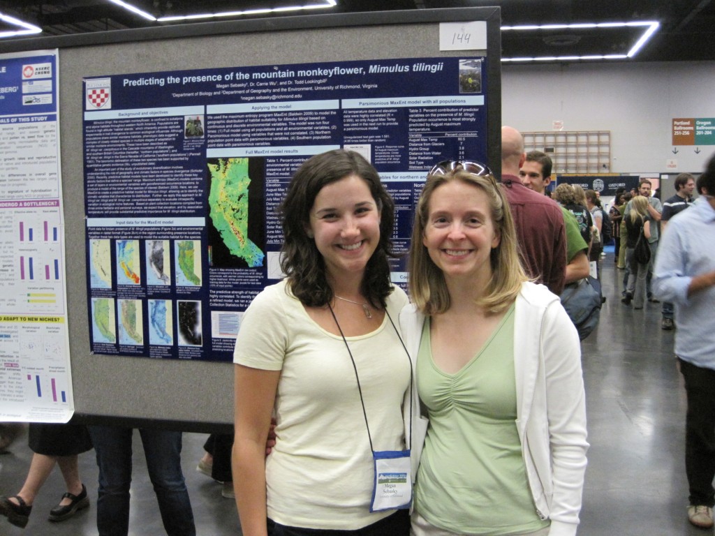
Wu and Sebasky at the Evolution 2010 Meeting

Megan Sebasky ’10 (l) and Dr. Carrie Wu (r) at the Evolution 2010 meeting presenting their ecological niche modeling research.

The University of Richmond prides itself on offering plenty of opportunities for undergraduate students to perform rigorous research alongside one of the University’s excellent faculty members, many of whom are experts in their fields. Often, these undergraduate research experiences help students determine their future endeavors and offer them a chance to have their name on published material soon after college. Megan Sebasky ’10 not only took advantage of undergraduate research by working with Dr. Carrie Wu, Assistant Professor of Biology, but also used her GIS expertise to further the value of her research.

Sebasky majored in biology and environmental studies; while a rising senior, she joined the lab of Wu, who had recently been hired at the University of Richmond after working at Duke University. At the time, Wu was working on research focusing on the plant species Mimulus tilingii, commonly referred to as the mountain monkey-flower. Sebasky mentioned she had GIS experience, thanks to the classes she took here in the Spatial Analysis Lab, which immediately attracted Wu’s attention: Wu’s research about the mountain monkey-flower contained a strong geographic component, one which would immensely benefit from GIS.

In particular, prior research had indicated that there may be two separate sub-species of Mimulus tilingii, one located primarily in Oregon and Washington, and another found further south in California. One approach Wu had identified to test whether there were actually two species involved ecological niche modeling, or using spatial information about environmental variables to determine the exact ecological conditions a species needs to thrive. If Wu and Sebasky were able to determine that the two presumed sub-species required different environmental conditions, they would have strong evidence to conclude that these sub-species were indeed taxonomically different.

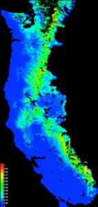
MaxEnt output for mountain monkey-flower

An output map from MaxEnt, showing the predicted occurrences for the mountain monkey-flower as a whole.

Sebasky conducted her side of the research by using ArcGIS as well as software called MaxEnt, which is among the most popular pieces of software for ecological niche modeling. Using the heat maps produced by MaxEnt, Sebasky and Wu determined that not only was the mountain monkey-flower ecologically divergent from its nearest relative, but that there were two distinct groups whose ranges split near the California / Oregon border. In addition, they found that cold temperatures were especially important for delimiting the ranges of the two sub-species. Armed with this new knowledge, they traveled in 2010 to the Society for the Study of Evolution’s annual meeting, which was held that year in Portland, Oregon, to present their findings. A full write-up of the research is forthcoming.

This success would not have been possible without Sebasky’s experience in GIS. While Wu was familiar with GIS, she admits to learning a lot more from Sebasky; since then, Wu has encouraged other students to pursue research projects with GIS components and to take the GIS classes offered at the University of Richmond. “Even when I go to professional meetings [for biology],” Wu says, “[GIS] is coming up more and more. … It’s not just one little corner anymore.” And like any good academic, Wu hopes to continue to learn more about GIS as she continues throughout her research career.

As for Sebasky, the great experience she had with her undergraduate research led to her present educational endeavors. Currently a Master’s student at the University of Virginia, Sebasky is continuing to work on GIS-informed ecological niche modeling, looking at an invasive species from Europe now found in the United States. Says Sebasky, “In grad school, I have found that ecological niche modeling has become extremely popular in the literature and being able to do it is an extremely helpful skill set to have. I have been doing a lot of networking at conferences … and people are really interested in what I’m doing.”

Here at the SAL, we are glad to see our alumni achieve these great accomplishments and know that the strong GIS foundations they received as undergraduate students help them to reach these outcomes. And we will continue to support our phenomenal faculty in Biology, and indeed all the academic departments, as they find ways to enhance their research with GIS!

Identify #1: Justin Madron

Identify is a new, monthly series here on the SAL blog, focusing on students, faculty, and alumni of University of Richmond who have used GIS in exciting ways. Come by each month to learn more about the interdisciplinary nature of GIS here at UR.

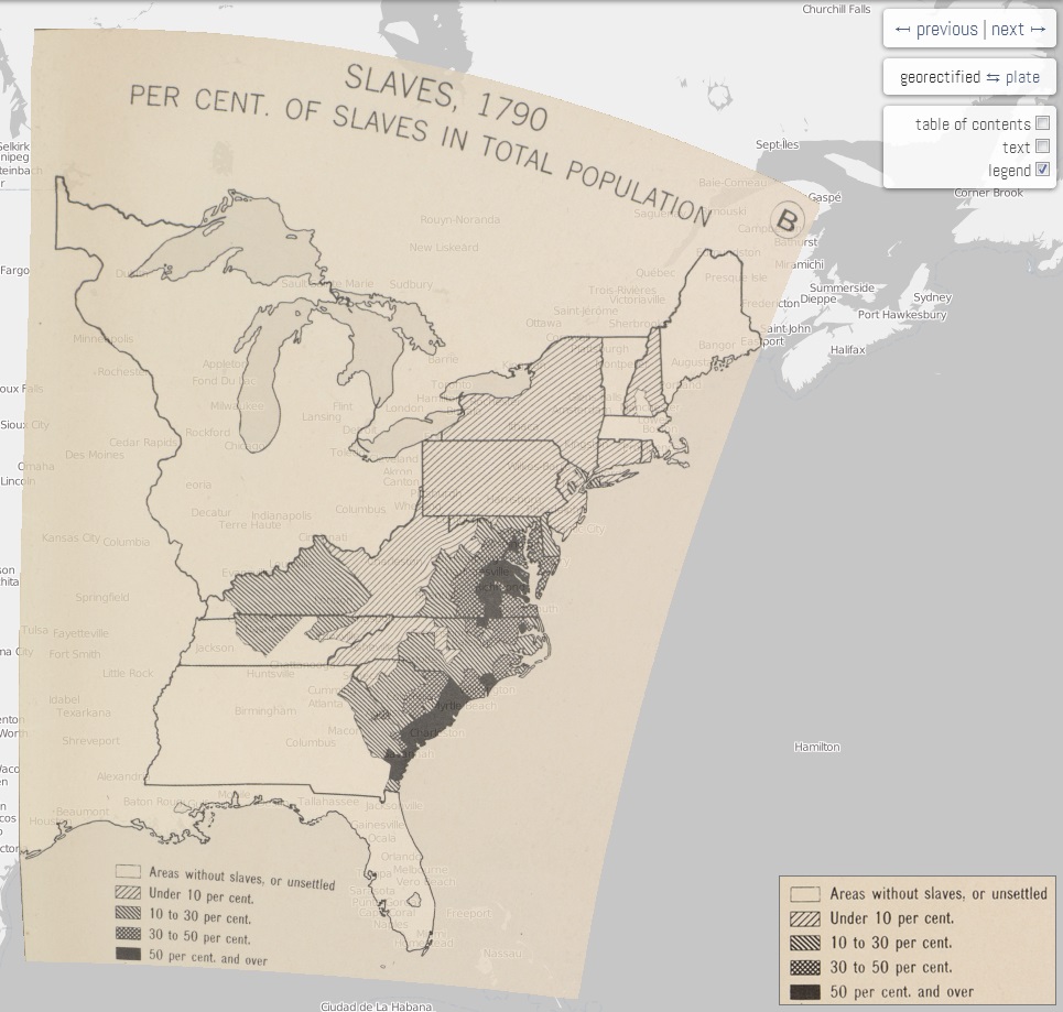
The DSL's Paullin Atlas

An early glimpse at the DSL’s Paullin Atlas project.

Over the last few years, the University of Richmond has greatly increased its GIS presence on campus. Not only has the Spatial Analysis Lab become an even more active place, but various University departments have hired full-time GIS staff. Among these new hires is Justin Madron, the GIS Analyst for the Digital Scholarship Lab (DSL). Madron, who got his Master’s degree this previous spring from Virginia Commonwealth University after receiving his Bachelor’s degree from West Virginia University, has been learning about GIS since his junior year at WVU.

While at VCU, Madron got an internship to work with the University of Richmond and professor Dr. Todd Lookingbill on a project to create a Natural Resource Condition Assessment for Petersburg National Battlefield. During the internship, he continued to hone his GIS skills and simultaneously became familiar with the UR environment and the geospatial resources available here. When he graduated in May, he knew he wanted to continue in GIS; after all, he says, “that’s why I went to graduate school.” Thanks to his connections here at UR, he heard about a new position in the DSL and applied for the job.

Madron began in July and since then has been hard at work with a few mapping initiatives. First has been a project to digitize Charles O. Paullin’s Atlas of the Historical Geography of the United States. This comprehensive atlas, first published in 1932, contains nearly 700 detailed maps of the early United States, looking at both physical and human geographies. The DSL’s project, which they aim to finish by the end of this autumn, digitizes these maps to view via an online interface, animates them to show changes over time, and makes them interactive, so that users can click on states or counties to see specific data for that area. The Spatial Analysis Lab has already been offering some assistance to Madron and the DSL with this project, beginning to form a knowledge- and data-sharing relationship between these two departments.

But the Paullin Atlas project is a sort of “warm-up” for the DSL’s bigger project. In January, the DSL was awarded a three-year, $750,000 grant from the Andrew W. Mellon Foundation to establish a comprehensive digital atlas of American history. With Madron’s help, the DSL will create two volumes of the atlas out of an eventual planned ten; the first volume will focus on migration, communication, and transportation, while the second will focus on the environment. The Spatial Analysis Lab will be contributing to this project as well, hopefully hosting the DSL’s data on our data servers, in an effort to have even better data sharing across various departments.

Madron is excited to work on these projects and is evidence that experience in GIS can land people unique and cutting-edge jobs. “GIS has opened a lot of doors for sure,” says Madron, “and it is fun.” Look for more updates from the DSL’s mapping projects on their website or here on the SAL blog!

Summer in the SAL 2013

It’s hard to believe, but in exactly two weeks the new students—the Class of 2017—will arrive on campus to begin their University of Richmond experience. But even though the summer is almost over here at UR, the Spatial Analysis Lab has been a busy place for the past few months! Here are some brief highlights of our Summer 2013.

The SAL team for the Gottwald Games

The SAL team also placed fifth this summer in the annual Gottwald Games—it was our first appearance!

  • The Department of Geography and the Environment welcomed a new staff member in July—and, yes, it’s me, serving as the GIS Technician for the department. This post-baccalaureate position will give me lots of behind-the-scenes experience with running a GIS architecture, will put me in contact with many faculty and staff at the University, and will help ensure that the SAL and its students are achieving as much success as possible.
  • At least three student research projects were based out of the SAL this summer. Two students worked with the Chesapeake Conservancy and used remote sensing software to identify specific areas of land in the Chesapeake Bay watershed that contribute most notably to pollution in the Bay. Two other students continue to work on a Natural Resource Conservation Assessment report for the nearby Shenandoah National Park. And another student made good use of our GPS technology to document lead levels in trees near the Richmond International Airport. These students will present their work and their findings over the next year; stay tuned to the blog for updates!
  • We’ve continued to explore storymaps—interactive, online web maps that are specifically tailored to communicate some information. In the past, we’ve uploaded data to be stored on a cloud computer, but this summer we’ve learned how to store our data locally and serve that data live. So now, when you access a map such as this one showing farmers markets around Richmond or this one looking at the imperial fora of Ancient Rome, you’re seeing a live look at our data. Expect many more customized, interactive storymaps over the next few months.
  • We’ve formed new partnerships with various departments and offices around the University, all of whom are excited to make use of our geospatial resources. For instance, over the next year the SAL will be helping students and staff in the Music Department, the Center for Civic Engagement at UR Downtown, the University Museums, the Digital Scholarship Lab, and even the Office of Emergency Management. We’re also exploring the possibility of incorporating some of our spatial data into the official University of Richmond campus map.
  • Finally, we’ve been preparing for and undergoing a massive hardware and software update. Just today, the Center for Teaching, Learning, and Technology updated the SAL computers and soon we will be receiving a new large-format printer for printing maps. On the software side, all the University computers will now run ArcGIS 10.1 as will our database server and our web server, giving us greater ability to publish maps online. These updates will make sure that UR students are on the cutting-edge of GIS technology.

We’re looking forward to another exciting year in the SAL. Expect much more frequent updates here on the blog, be sure to follow our account on Twitter @UR_SAL, and be on the lookout for exciting online storymaps! And above all, enjoy the final few weeks of your summer.

Student Blogger: Chase Eager


Geography and Health Care

Geography and health care are becoming increasingly related, and in a way that can save lives and promote healthy communities. The relationship between geography and medicine dates back to the 1850s, when Dr. John Snow used cartography to map the outbreak of cholera in London and track the source, a water pump. Today, health care professionals have teamed up with spatial analysts in order to tackle a variety of problems in health care, and in much more advanced fashion than Dr. Snow’s work.

GIS is used in health care on many scales.

GIS can be used in a hospital, such as Loma Linda University Medical Center, where ArcGIS is used to monitor patients’ locations and information throughout their stay. The system tracks patients and their information when they check in, any time they are moved, and when they are discharged. This allows physicians and nurses to stay updated in real time on their patient’s status, which reduces administration costs and makes the process more efficient and accurate.

Jewish Hospital HealthCare Services uses ArcGIS in order to aid employers in helping their injured employees through locating specialized rehabilitation locations close to work. ArcGIS is used to map locations of patients’ homes and workplaces and locate the nearest rehabilitation location, which informs patients of the closest clinic to work. Using GIS, they found that many were not attending the closest because they were unaware that there was a more convenient location.

GIS can also be used to find where there is a need for new clinics. This is done by mapping the location of existing clinics in addition to mapping health statistics and demographics for a county, such as the percentage of the population that is in poverty, the percentage of high school graduates, the percentage of adults with high blood pressure, and the percentage of uninsured adults. This reveals where there is a need for new clinics.

Another phenomenon that has become popular due to Atul Gawande’s New Yorker article is known as hot spotting. This idea was started by Dr. Jeffery Brenner in Camden, New Jersey. He got access to three hospitals’ billing records and created maps of where crime victims lived and where ambulances picked up patients. He discovered that one apartment building had more patients sent to the ER than any other, which was a low-income housing unit. He took this information he learned from mapping high incidents of ER visits in order to start The Camden Coalition, which focuses on giving extra care to the most expensive patients in order to ensure that they stay out of the ER.

Finally, the Dartmouth Atlas has made discoveries that have become popular in health care reform. This project maps variations in health resources and statistics across the United States. They have revealed that there are places that vastly overspend on patients when it is unnecessary, and this greater utilization of care doesn’t yield greater results.

These are just a few examples of how geography is becoming increasingly important in the field of health care. ArcGIS provides advanced technology that helps health providers and policy makers examine health care from a new dimension, giving them greater insight into providing better care.

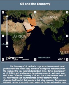
As a political science major and geography minor, I have combined my interests in geography and health policy through the creation of an independent study called “Mapping Medicine,” where I wrote a research paper on the spatial variation of health care spending across the United States, specifically focusing on Virginia (see sample maps above and below). I am currently doing an independent study in Geography where I am mapping health statistics in the Middle East. I am a member of Pi Beta Phi and a Spatial Analysis Lab Intern. I will be graduating in May and will move to Washington D.C. this summer to begin working.

Story maps with ArcGIS Online

A screenshot of the story map linked in this article“Traditional” maps—those printed on paper and created with GIS software like ArcMap, the software we use in the SAL—are certainly not going away anytime soon. But geographers cannot ignore the fact that Internet-based mapping is quickly exploding in use, allowing virtually everybody to access and to produce their own maps, without requiring any special hardware or expertise.

Esri, the company behind ArcMap, helps facilitate this growth of online mapping through ArcGIS Online, a new product that offers basic map exploration and creation functionality for organizations and for individuals. Users have already created and published thousands of publicly-accessible maps, and more are created each day.

The Spatial Analysis Lab has recently started to explore the potential of ArcGIS Online, especially through the creation of story maps. A story map is one that depicts spatial data but goes further to explain what the data mean and to contextualize its importance; a story map intends to reach a wide audience and to explain the significance of the spatial information.

Students in the SAL began publishing maps in ArcGIS Online earlier this year, and recently, other students have taken some of those maps and turned them into story maps. You can see an early result of the story map efforts here. This story map is only a first step, so far, but it already reveals the great potential story maps can have in communicating spatial information. In general, you can review a gallery of Esri-published story maps here.

Moving forward, students in the SAL are learning how to create maps in ArcMap and upload them to ArcGIS Online, in order to have greater control over map design and content. And looking ahead, students will be adding those maps to a server, so that any changes they make to those maps in ArcMap will automatically be pushed to the story maps published in ArcGIS Online.

Online mapping is a nascent art, so the SAL is excited to be on the cutting edge of spatial analysis. Look forward to more story maps soon!

from the director’s desk

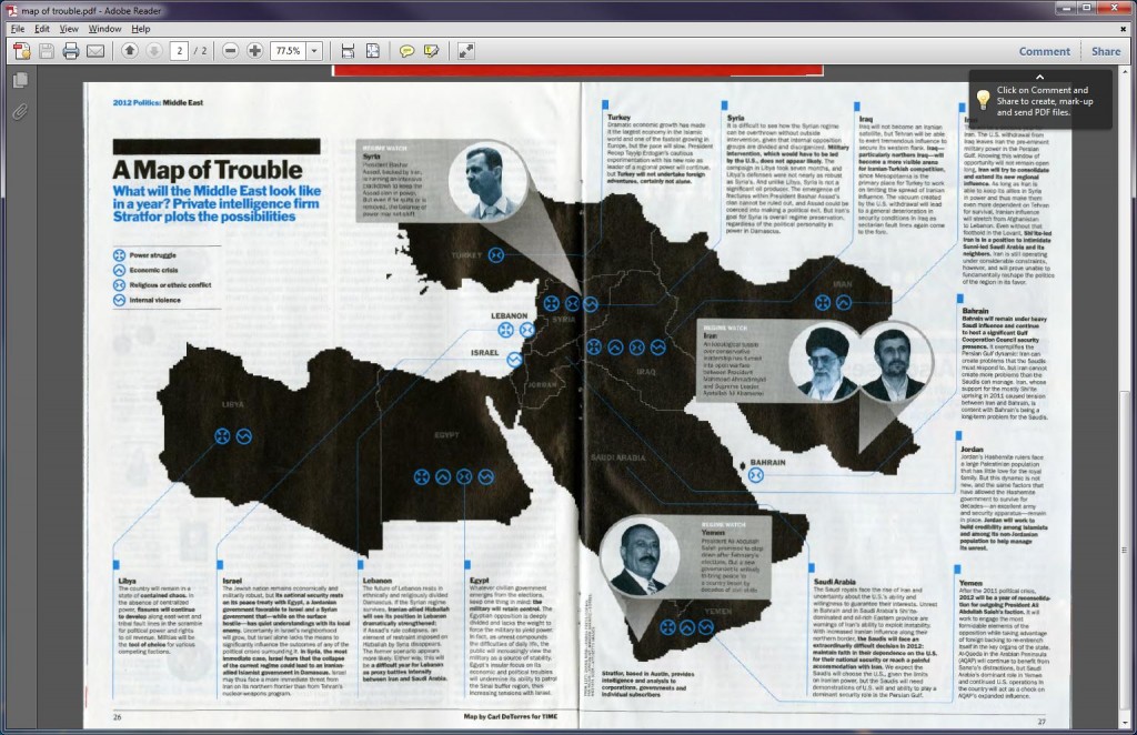
TIME Magazine recently published this disturbing image titled “A Map of Trouble” (TIME, Jan. 3 2012; 26-27).  My response and my counter-map are inspired by the work of Mark Monmonier (How to Lie with Maps) and J.B. Harley (Maps, Knowledge and Power).

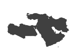
First, the title and the graphic shape of the “region” are linked together in the reader’s mind.  Trouble = Middle East = Bad is the not-so-subtle message.

TROUBLE  =   

In the same way that:

LOVE  =   

and

HAPPY =

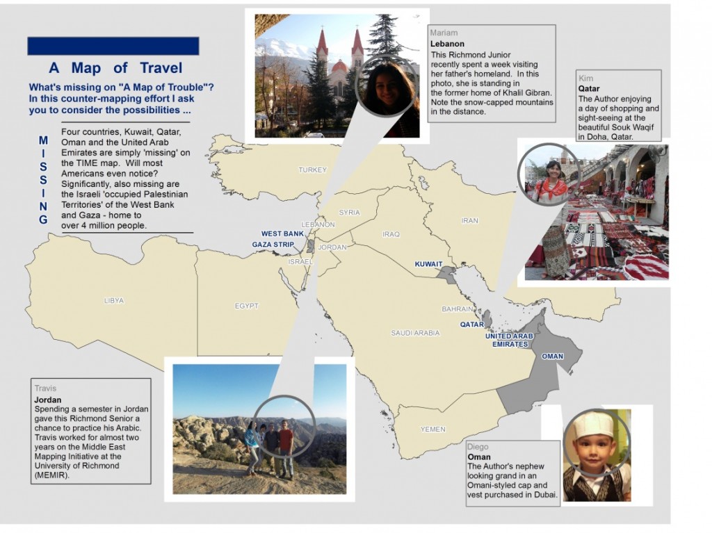
Second, the lack of color, the choice of markers resembling hazardous waste dumps, and grey-scaled photographs of men (disturbing ‘others’) help to reinforce the negative message of the map.  Contrast these with the colorful photos included on my “Map of Travel”.  For Harley, “maps are never value-free images.”  “Both in the selectivity of their content and in their signs and styles of representation, maps are a way of conceiving, articulating, and structuring the human world which is biased towards, promoted by, and exerts influence upon particular sets of social relations (Harley 278).”  “A map can carry in its image such symbolism as may be associated with the particular area, geographical feature, city, or place which it represents (Harley 279).” How might our perspective change if we were constantly bombarded with maps and images of smiling people, beautiful scenery and colorful markets?

Third, the map contains several blatant omissions.  The countries of Kuwait, Oman, Qatar, and the United Arab Emirates are simply NOT THERE (neither is Afghanistan or Cyprus for that matter).  The four absent countries fall within the extent of the map – will they not be missed?  Why were they excluded?  Harley says “maps – just as much as examples of literature or the spoken word – exert a social influence thru their omissions as much as by the features they depict and emphasize (Harley 290).”  Significantly, the Israeli-occupied territories of  the Gaza Strip, and the West Bank (aka the PALESTINIAN TERRITORIES) are neither on the map nor mentioned in the vignette.  Could this be a case of the “predictive art of using maps to project and to legitimate future territorial ambitions? (Harley 289).”  Or was this simply an oversight?

“Map users seldom, if ever, question these [the map makers], and they often fail to appreciate the map’s power as a tool of deliberate falsification or subtle propaganda (Monmonier 42-45).”  “Savvy map viewers must recognize that not all maps are intended solely to inform the viewer about location or geographic relationships.  As visual stimuli, maps can look pretty, intriguing, or important.  As graphic fashion statements, maps not only decorate but send subtle or subliminal messages about their authors, sponsors, or publishers (Monmonier  43-45).”

Counter-maps – maps of peace, maps of potential – maps of nuance – must be created and shared to balance overly simplistic and negative maps.  This is one of the chief motivations behind MEMIR – the Middle East Mapping Initiative at Richmond.  Join us!


from the director’s desk

Got GIS?

My original plan for this blog entry was to shamelessly promote GIS Day (November 16th)  – write something about this year’s t-shirt – and link it somehow to Geography Awareness Week. Fortunately, one chance occurrence has changed all that.

Picture this: a Sunday afternoon spent grading and helping students in my lab, and a workshop in the next room.  A chance encounter in the hallway.  “So, I see you teach in the Spatial Analysis Lab?  What is that?”, she asks quite innocently.  I explain.  “Oh (awkward pause) … well … what department would something like that fall under?”  I ignore the “something like that” part and answer as sweetly as is possible while drawing blood on my tongue because I know what’s coming next.  “But,” she continues … not meaning to be ignorant or offensive in any way, “what is it called?”  “GEOGRAPHY”,  I repeat .  “Well, I’ve already got a GPS.”  And with that, my new friend exits and my heart races like something from Rocky and Chariots of Fire combined and the conviction I have to educate people about my discipline is so deep I consider wrapping myself in maps and walking around campus as “Geography Girl”.  Thankfully, I’ve got two teenage daughters at home who know how to draw the line so that they aren’t forever banished from public life.

There is a great article written by Dr. Jerome Dobson of the American Geographical Society called “Bring Back Geography!”  In it he addresses both the idea of geographic ignorance (not knowing where places are) and ignorance of Geography – the discipline, which, by the way, is much more than knowing your state capitals, longest rivers, and highest mountain peaks.  “Geography Awareness Week” was created in 1987 by the National Geography Society (and others) to address this knowledge gap.  GIS Day is held on the Wednesday of Geography Awareness Week – its purpose – demonstrate the important contributions GIS is making to the discipline of Geography and to our world.

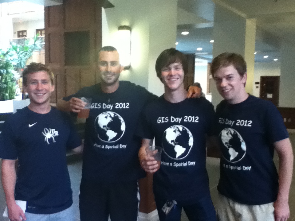
Now for the t-shirts and shameless promotion.  Each fall my Introduction to GIS students help the University of Richmond celebrate GIS Day by hosting an open house in our lab, inviting speakers to campus, baking (and eating) cakes, and wearing cool t-shirts.  Visitors can spend 6 minutes or 6 hours at this year’s event.  Our shirt design – “got gis?” has taken on special significance for me after a recent encounter with one of my students.  She and her partner were attempting the first part of a fairly complex three part analysis.  Their task – areal interpolation – involves disaggregating data from census tracts and then reaggregating it for hydrologic units.  Numerous frustrating failed-attempts and numerous questions answered with more questions (“Professor, why xyz?” … “Well student,” I answer wisely and patiently, “have you considered abc? Or perhaps the impact of d and h?” … I try to direct the student to find the answer instead of giving the answer outright) had nearly driven this pair to the breakpoint when suddenly she jumps out of her seat (and I’m not exaggerating – while parts of this blog entry may be fictional this is not one of those parts) and yells “GET SOME!” which in this context means “Oh yes, I am so satisfied with myself and really excited that I solved this problem that was very challenging” – perhaps a raunchy equivalent of yippee or yahoo.  That’s deep learning. So, for those who don’t “got gis?” I say only this: get some.

– Kim Klinker

From Numbers to Spatial Analysis: The Possibilities of GIS in an Academic World

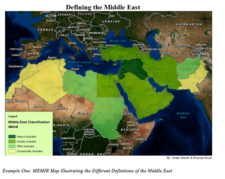
The Middle East definitely receives a substantial amount of global media attention; however, it is often a misunderstood region.  Even outlining the Middle East on a world map creates controversy amongst scholars.  Should the region’s border be based on common history? Language? Religion? Culture?  The fact of the matter is that the Middle East (wherever that may be) has such a diverse background that trying to fit it into these ridged categories does not do justice to its true diversity.  The Middle East Mapping Initiative at Richmond (MEMIR) strives to illustrate the unique characteristics of the contested expanse utilizing a geospatial platform.

Rather than looking at a chart with quantitative data, ArcMap (ESRI’s Geographic Information Systems (GIS) software used by the University) projects statistics onto a map, giving it a place and context – a key tool for young academics unfamiliar with the layout of the Middle East.

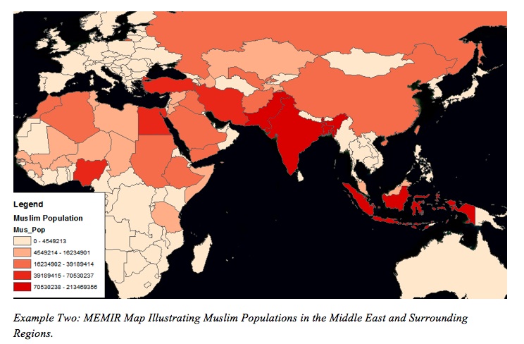
In the Spring of 2011 the Middle Eastern geographies class utilized GIS to create informative visuals illustrating key concepts discussed in the classroom.  With no prior GIS experience all of the students executed great maps by extracting data from the University’s extensive MEMIR database.  With these visualizations students learned that Muslim populations are not concentrated in Western Asia, but rather they are more prominent throughout India and Indonesia, clarifying the misconception that the Middle East is the same as the Islamic world (See Example Two).

Students also constructed an illustration of the different extents of the varying definitions of the Middle East (See Example One), and even compiled images to create a mini movie showing the growth of populations in urban areas throughout Middle East (See Example Three).

Urbanization in the Middle East

Example Three: MEMIR Video Illustrating Urbanization in the Middle East and Surrounding Regions


I know for me at least that these exercises really expanded my true understandings of the “real” Middle East.  Therefore, I encourage all academics to employ this powerful technology into their work in some shape or form, and we (the interns) are in the Spatial Analysis Lab to aid in transforming your vision into a tangible and informative project.

from the director’s desk

September 12, 2011.  Today was a great day.  I arrived early to make sure all the computers were working and that I had enough handouts for my Human Geography students.  Ethan arrived early to make sure the GPS units were charging for an outing with my GIS class.  My students arrived and began a lesson created to help them learn about Territorial Morphology and Boundary Typology using GIS.  Working with a partner they navigated the world map looking for prorupt and perforated states  – “Does Vatican City count?  What about Azerbaijan?”  – it’s clear that many of them haven’t looked this closely at a world map in a long time.  “Where’s the Danube?”  “What’s next to Egypt?”  I love hearing the students talk to one another, and help one another.  I love the occasional “oh cool” that slips from their mouths.  But mostly what I’m so happy about is that none of the computers crashed.  Not one.  For the entire class period.  Success!

I think back to September 2010.  Students enter the Spatial Analysis Lab in the brand new Carole Weinstein International Center and begin what I tell them is going to be a very exciting lab.  They open the file, as instructed, and within 5 minutes computers start crashing.  When they don’t crash they run so slowly that instead of hearing the occasional “oh cool” I hear the occasional “oh damn”.  Students are rubbing their heads in frustration. “GIS”, they say, “stinks”.  Some students must exit completely, others begin texting while they wait for the computers to restart.  I’ve lost them.  I’d spent so much time creating these lessons – with the help of a Course Enhancement grant from the CTLT – only to face this.  The problem?  Data storage and retrieval.  Netfiles.  The solution: a Server.  It’s the only way to efficiently serve large amounts of data to a lab (or classroom) full of students simultaneously.  But, how to get there?  Money, cooperation from IT and IS and many other acronyms.  Training.  More training.  Loading data onto Server and rewriting all lessons for the new year and BAM!

Today, students completed their GIS Lesson without any technical difficulties.  No performance issues.  No slow drawing maps.  No crashing.  This is beyond great.  This is where I wanted to be.  Instead of being frustrated by the technology they were able to complete their lesson during class time.  They are gaining familiarity with concepts of human geography, spatial thinking, and rudimentary GIS skills.  In the first 3 weeks of school, our lab has been used by: 4 SAL interns, 4 Geography Faculty, 1 Biology Faculty, 1 Chemistry Faculty, 20 FYS – Biology students, 23 GIS students, 22 Human Geography students, 13 Mapping & Sustainability students, and 30+ Physical Geography students.  We’ve made maps for the Law School, the School of Continuing Studies and the Jepson School of Leadership Studies.  I’m so proud of how far this lab has come, and so excited about its future.  Yes, Vatican City counts.  The Danube – Europe.  And it’s Libya.  Libya is next to Egypt.