
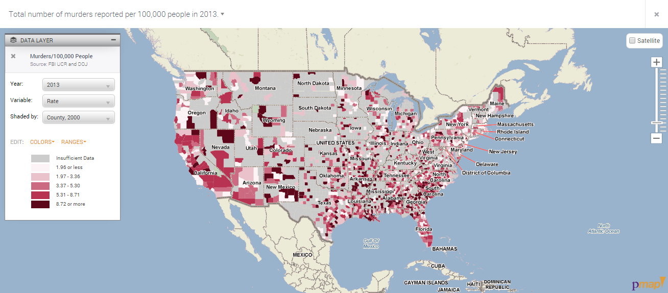
This map depicts the total number of murders reported in 2013, which was the most recent year provided, on the county level across the United States. These murder rates, according to reports filed, is filed by the TRF Policy Map maker as a indicator of the quality of life in different counties. Thus, those with lower reported murders rank higher on the scale of quality of life than those with higher reported murders at least where violence is concerned.