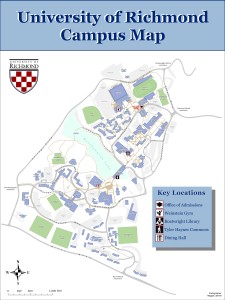
My map is a reworking of the large campus map on the information kiosk located outside the admissions office. This map’s intended audience is new visitors to the University of Richmond. To simplify the map, I deleted/adjusted unnecessarily complicated polygons and cleaned up the walkways and buildings so that the map looks less busy. While the previous map was almost entirely black and white, I’ve shaded sports fields, buildings, pathways, and roads with muted colors to differentiate them. Instead of a traditional legend, the box to the right highlights some areas that prospective students and their families may like to visit, symbolized with simple icons and outlined in Richmond red to stand out.

