Hollywood Cemetery

Last year, Dr. Winiarski’s students created digital story projects based on unique graves in Richmond’s historic Hollywood Cemetery. This web mapping application allows for the videos to be embedded in the informative section on one side of the screen while an interactive map shows the precise locations of each grave within the cemetery borders on the opposite side.

Scroll up and down to see pictures, videos, and learn more about Hollywood Cemetery!

link

Posted in Assignment 9 | Comments Off on Hollywood Cemetery

A “bad” map

One of my classes recently walked around Hollywood Cemetery to study the graves.  The cemetery layout and landscaping is beautiful – it looks like a park, but it can be hard to navigate. On the paper map, only some of the streets are labeled, there are no labels for any of the drawings or important places, there is no color to differentiate between sections, and all of the streets are the same size, even though some are only for walking and some allow vehicles.

Posted in Uncategorized | Comments Off on A “bad” map

Blunder Map

Rizza, Andrew, Maggie

BlunderMap

.
.
.
.
.
.
.
.
.
.
.
.
.
.
.
.
ANSWER KEY:

Westhampton Lake is now Westhampon Lake
President’s Home is enlarged
Bye bye B-School

Posted in Assignment 8 | Comments Off on Blunder Map

Large Campus Map

MaggieMap

My map is a reworking of the large campus map on the information kiosk located outside the admissions office.  This map’s intended audience is new visitors to the University of Richmond.  To simplify the map, I deleted/adjusted unnecessarily complicated polygons and cleaned up the walkways and buildings so that the map looks less busy.  While the previous map was almost entirely black and white, I’ve shaded sports fields, buildings, pathways, and roads with muted colors to differentiate them.  Instead of a traditional legend, the box to the right highlights some areas that prospective students and their families may like to visit, symbolized with simple icons and outlined in Richmond red to stand out.

Posted in Assignment 6 | Comments Off on Large Campus Map

My Map Progress . . .


campus map kioskCampusPaperMapFeb24

My map is a reworking of the large campus map that is displayed on the information kiosk outside of the admissions office. Much of my work has been simplifying polygons by deleting/rearranging vectors while still keeping the basic shape of the most important features on campus. This is one small section of what I hope the whole map will look like. Notice the introduction of color and labels!

Posted in Assignment 5 | Comments Off on My Map Progress . . .

Paper Map Project Plan

campus map kiosk

For my project, I will redesign the large campus map that is currently displayed on the information kiosk outside of the university admissions office.  This map is essentially an enlarged reprint of the standard flat map displayed on the UR website (like the ones we looked at in class).  With such a large space available, it doesn’t make sense to use the same elements you might put on a small, handheld map.  The list on the side is confusing, the numbered buildings look cluttered and messy, and the colors are drab.  On this new map, I will replace numbers in a list with labels on buildings, add color to the map, erase unnecessary data, and simplify the legend/iconography so it is more readable and user-friendly.

Posted in Assignment 4 | Comments Off on Paper Map Project Plan

The Swiss Cheese Map Reflection

download

I think Shari Motro did a great job explaining her point about map visuals and what to include or exclude when creating a usable map.  In order to cleanly and efficiently display information, cartographers must have an element of style in their craft and avoid “chartjunk,” or excess detailing that can crowd a map.  Whether or not the mapmaker intends it, maps can have real world consequences and make forceful arguments.  The gaudy “Swiss Cheese” map used in the 1995 Oslo II peace talks between Israel and Palestine illustrated how a simple difference in the way in which a map displays data can portray an extremely different feeling to the reader.  In a situation like the volatile Israeli-Palestinian conflict, it is extremely important that peace talks go over smoothly with little argument.  Later reworking the map aesthetically, not the data itself, proved to be much more helpful in later talks to show the area in a more positive, uplifting way.  I especially love how Motro equated a mapmaker with no sense of graphic design with a bad writer using a word processor – both are useless because neither could make a practical product.

Posted in Assignment 3 | Comments Off on The Swiss Cheese Map Reflection

Million Dollar Homes

Million Dollar Homes (PolicyMap)

Posted in Assignment 2 | Comments Off on Million Dollar Homes

Expensive Pets by County

Expensive pets (SimplyMap)


Posted in Assignment 2 | Comments Off on Expensive Pets by County

Why Am I Here?


Maggie Latimer

I am taking Maps and Geovisualization for several reasons: it is relevant to my major, it fits into my schedule, and I know the professor (one of them, at least) and her style of teaching.  This course also sounded like a good class to use as a transition into a more advanced GIS course, should I choose to pursue it in the future.  I took Intro to GIS last year, and while I learned a lot and thought it was really interesting, I felt like my computer skills were not always up to par.

I really like the idea of investigating the artistic side of cartography and learning about how and why specific choices may convey particular meaning on a map.  The concept of reading maps and recognizing how they can “lie” is extremely fascinating to me.  I would love to do some evaluation of maps, in what ways they can sometimes be misleading, the mapmaker’s stylistic choices and what those choices entail, and how this can affect society on a greater scale.

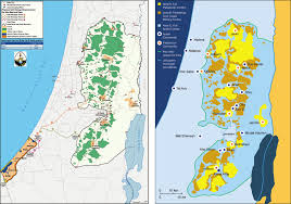
One reason I love geography is because it is so versatile.  It can be applied to almost any other discipline and adapted as both a scientific endeavor and an art form.  Looking ahead to the future of GIS in the workforce, understanding spatial analysis seems to definitely be a growing skill that is rapidly becoming a much-wanted talent.  Employers from many fields of various interests are looking for workers who know how to use spatial analysis software and have experience making different kinds of maps.  For my own future (which is quite the scary thought), I’m thinking of possibly working in humanitarian aid and development.  Nonprofit organizations, for example, utilize different types of maps that show social issues and solutions from small, local communities to a global scale.  Maps can be used to show matters of public health, environmental changes, emergency response systems, and more.

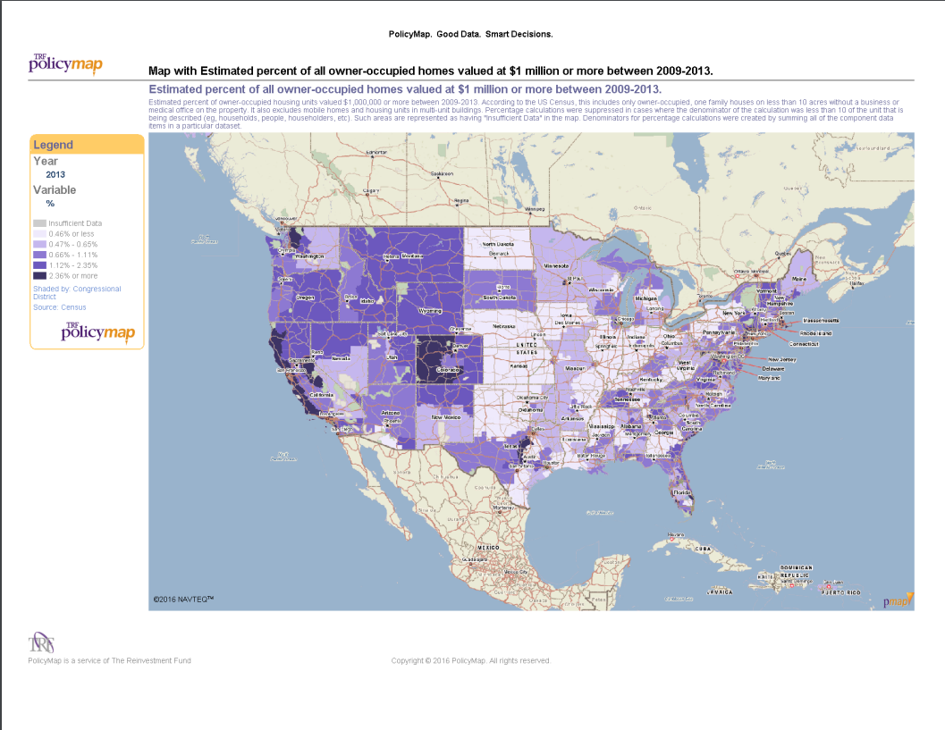
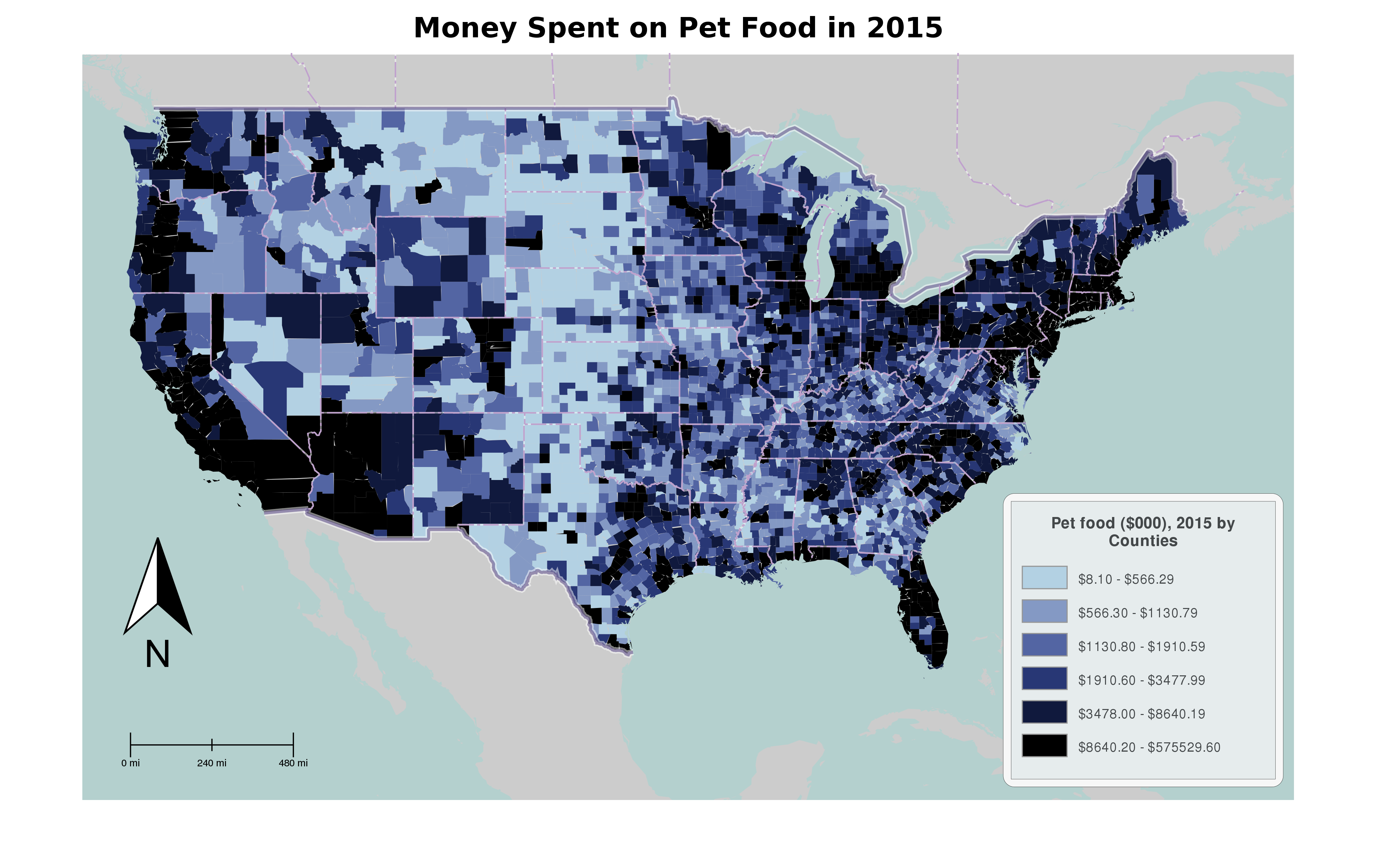
Maps are a highly efficient tool when trying to convey a large volume of information about a place.  I love studying maps as visual aids because they are often much easier to read than wordy reports.  Complex information that is easily lost in complicated data sets or graphs can be clearly understood through a well-designed map.

For my projects in this class, I will explore the programs we use and learn to make useful, attractive maps that display worthwhile information.  I want to learn how to recognize a “truthful” map versus a “dishonest” one.  By the end of the semester, I hope to decide whether I am willing to go further with GIS in school and maybe even in my career.  I’m excited to revisit digital mapmaking using a more artistic approach and develop my skills (and my confidence!) using ArcGIS.

Posted in Assignment 1 | Comments Off on Why Am I Here?