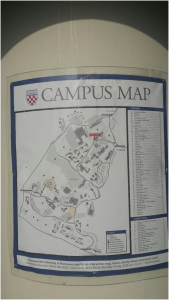
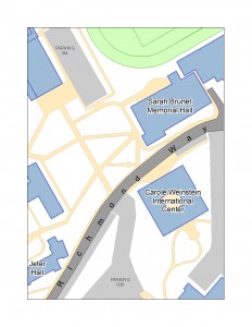
My map is a reworking of the large campus map that is displayed on the information kiosk outside of the admissions office. Much of my work has been simplifying polygons by deleting/rearranging vectors while still keeping the basic shape of the most important features on campus. This is one small section of what I hope the whole map will look like. Notice the introduction of color and labels!


