From today’s reading/podcast, but more specifically the podcast, Dr.Bezio discussed the importance of statics and numbers in humanities work, as well as how easily numbers can be manipulated, used to manipulate people, and how inaccurate they can be. There were a few examples she gave that stuck out to me the most. One being how the way you present data can change someone’s feelings and interpretation on it. The example Dr.Bezio gave was “only 25 percent of covid patients will be asymptomatic”, versus “One in four people who catch covid will not be symptomatic”. The second example sounds like a lot more people, and also sounds like a one in four chance of winning. It really made me start thinking about information and data I have heard within my own life, and thinking about how the way data is presented can change someone’s feelings. This makes me think about the classic “glass is half full” verus “glass is half empty” saying. One example has a more positive connotation, making you feel better about the amount you have in the glass, while the other has a more negative connotation, just like the example Dr.Bezio gave that I explained above.
Another example Dr.Bezio gave that was very interesting and important to me was the idea that how we get numbers and where you get samples from is important in the validity of data. The example given was about if college students like chicken nuggets, and how evaluating just our class based off of this was not enough people,diversity, etc in order to determine if it is accurate. This really shows you that when you are examining a set of data, you need to think carefully and really investigate the data you are looking at and using. This ties into the big concept of checking your sources.
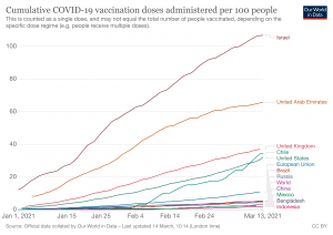
For the chart/graph we need to add to this blog post today, Because of the current state of our world, I decided to find a graph that shows our positive progression of COVID19 by looking at the amount of people who have been vaccinated.This graph shows specifically the cumulative COVID-19 vaccination doses administered per 100 people per country since January of 2021. I like this graph because not only does it show positive progression towards herd immunity with the amount of people being vaccinated (and which countries are having the most people vaccinated per 100 people in their countries currently), but the chart on this website seems to be the most accurate with some of the most detailed information out there. This graph is updated daily (with the graph below being from today, march 14th), and by going onto the website there is even more detailed data. They also list a full dataset of sources, showing that they are coming to these conclusions from valid sources, and that they are really doing their research before sharing it with the public (for some reason the chart is not showing up clearly on this blog post, but you can use the link below to see this chart in detail).
https://ourworldindata.org/covid-vaccinations

