-


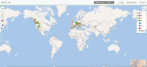
- This is a visualization of mountain ranges across the world that range from 0 square kilometers to a thousand square kilometers. The pink dots are mountain ranges that are 0 square kilometers to 8.8 square kilometers. The purple dots are mountain ranges that go from 12.11 square kilometers to 98 square kilometers. The orange dots are mountain ranges that go from 100 square kilometers to 987.3 square kilometers. The green dots are mountain ranges that are 1000 square kilometers to 9961 square kilometers. This type of visualization is called a map. Maps are usually used to help us analyze and interpret information based on the context of space. We are able to see if there are patterns in certain places of the world in terms of geography in this instance with mountain ranges. It is used to give us a better sense of where things are in the world. I also used the table to help me organize my map. I knew I wanted to stay within the 0-10,000 square kilometers range. I was able to learn what that was by sorting the table starting at 0 square kilometers. The table showed me that the 0 to 10,000 range were numbers 1 through 4 in the column area scale in kilometers. Then I went to my map and unchecked all of the boxes that were not 1, 2, 3, or 4. First, the table having all of the square kilometers in order was super effective when narrowing down the locations I wanted to look at on my map. Second, the map having a key where I can pick and choose the range of mountains I wanted to look at was super effective. I liked how it was color coded too so I didn’t have to click on every single coordinate to figure out the square kilometers. An interesting visual for me when looking at the map was how many mountain ranges are in the western part of the United States versus the eastern. This was interesting to me because I expected there to be a little bit more in the east. Especially when you start to get closer to Canada in upstate New York.
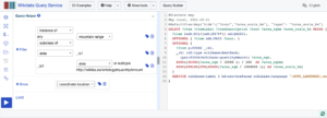
- My experience creating this visualization was a little frustrating. I have never coded or used this website before. I wasn’t really familiar with what the instance of meant versus substance of. It got tricky at times when I would plug things in looking to get a map as my visualization and there was none. It was also hard coming up with something I wanted to focus on since you could just about do whatever you wanted. Once I plugged in a map when I clicked on the examples tab, it became a lot easier to find a topic that included one. I would have liked to learn more about what the actual code meant on the right hand side of what you would plug in. I wonder if that made more sense to me it would have been easier to get my topic and a map.
- My plan is to look at female comic artists and or publishers that are similar to my comic artist, Grace Drayton. Topics could be female comic artists or publishers that were born in the same state as her or that have won similar awards as she has. I think the visualization that would make the most sense would be a table. The table allows me to sort through where these other women are from and their accomplishments. As well as what they do for work. I can also easily add an item description so it will show in the table rather than me having to click on each woman individually.
assignment #4
by
Tags: