Wikidata Visualization

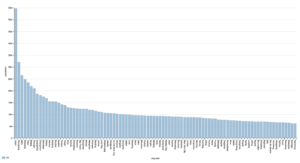
The visualization I chose to do was of the top 100 largest cities in the world. I am depicting the information by putting them in a bar chart from largest to smallest population size. The x axis is showing the name of the city while the y axis is showing the population in millions of the city. This visualization makes it easy to see which ones are the biggest and how comparable they are in size with the other cities without having to read the numbers. I chose a simple bar graph with only two axis. I chose this because I was only looking to compare the population of the top 100 cities. If I was comparing another piece of information, I would have made it a more complex graph or chose a different form of visualization. A bar chart is useful because each of the city’s sizes are unrelated to each other and are not continuous, they are comparable. Also, it is easier to see a visualization of how much bigger a city is rather than trying to understand and compare numbers. An interesting point is how much larger the biggest city is compared to the second largest. Other than the first and second city, they all slowly decrease in size without a huge gap between them. A bar chart makes it easy to compare multiple units. Another interesting thing I noticed was the most populated city in the world is in Nigeria. If I had to guess before looking it up, I would have guessed a city in China. That could be depended on when the poll of the cites were taken. I was not able to find a date of when the data was taken. It could be from years ago or it could be the most recent poll. Also contributing to that, each cities poll could have been taken at a different time. For example, on country could have recorded their population size from 2002 and another city recorded their size from 2023.
At first when I was creating the link for the visualization I could not figure out how to save the bar chart instead of it going back to the default setting of bubble chart. I then realized I had to go into the code and change the part that said bubble chart to bar chart. Once I changed it and ran the code, I was able to copy the link for the correct visualization. Also, instead of showing 500 cities or 150 cities I was able to change the code to only top 100 populated cities. I want to learn more about creating the code to be more unique. I was trying to find information on my cartoonist to see if I was able to create a code more specific, but I could not figure out how to make it work.
My plan is to create a bar graph that shows top country with the most cartoonists. I plan on doing that by changing the information from population to cartoonists and from top city to top country in the world. It would essentially read top country with most the most cartoonists. The bar graph would show in order of most cartoonists to least number of cartoonists in each country in the world. The bar graph will also be a good depiction of this information because it is also comparing a unit of information that is not affected by the other. Each number can stand alone.