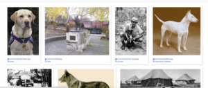

My visualization shows various images of dogs. Each picture is labeled that gives the viewer information about the dog, including the dog’s name, title, breed, and sometimes even gender. Viewers can better understand what or who they are looking at by seeing each dog’s photo alongside a label. An image grid shows images in rows and columns, similar to how a collection of photographs might be presented in a photo album or gallery. With this layout, multiple images can be viewed at a glance, offering viewers a convenient display to compare ideas or browse through a large collection quickly. In addition to the corresponding label beneath each dog image, this visualization provides a quick reference for the dog’s name or other relevant details. In addition to allowing viewers to identify or relate to the image immediately, the grid format helps enhance the viewer’s engagement with the data set because it clearly and effectively structures the content. The picture named “Néro” is very interesting. Unlike the other images, which are regular photos, this one is a dog statue. This made me think that Néro might be an essential dog in history or culture. I want to know more about it because it stands out in the group and has a unique story or meaning.
What is your experience creating this visualization been like? Be specific: what was effective, what was clear, what are you struggling with, what do you want to learn more about?
Creating this query visualization has been a mixed journey for me. On the positive side, I found my visualization’s overall structure and layout to be straightforward. The grid display is easy to understand and provides a logical way to present the images. However, my main challenge has been dealing with the codes. I needed to familiarize myself with all the coding details, so I had to spend significant time figuring that out. The difficulty and technicality of coding can be overwhelming, especially for those who need to be better versed. I found the example tool the most helpful. Going forward, I’m excited to improve my coding skills and understanding how to make query visualizations more dynamic and interactive. This would enhance my data set appearance and experience, making the content more engaging and accessible
What are your plans for completing Critical Creation #1? What kind of a visualization are you planning to mak
I will look at Dale Messick and her popular Brenda Starr comics for my project. I want to make a simple picture grid showing her top works. First, I’ll research which Brenda Starr stories people like the most; after picking them, I’ll find pictures of these comics and use a grid to show them neatly. I will add short notes under each image to give more info about each comic and its significance. This will help people enjoy the art and learn a bit about Brenda Starr at the same time. I aim to make a fun, easy-to-understand display celebrating Dale Messick’s work.