
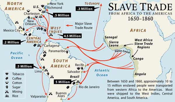
This map of the week, unfortunately not a cheerful one, is a map of the slave trade from Africa to the Americas from 1650 to 1860. This was during a time that the Atlantic Slave Trade route was the most successful trade route. The Triangular Trade Route was a trade route comprising enslaved African Americans who were shipped to Europe and the Americas. This map, however, only focuses on the trade between Africa and the Americas. It erases a lot of other important information so that it can highlight the important relationship between Africa and the Americas at this time. For the purpose of this map, Europe is only given one arrow that points in the direction of Europe, to remind the reader that there were still slaves being sent there. As we can see, the Americas, especially South America, were a dominant force in this slave trade. Because of its pictographic nature, this map is able to show the importance of the slave trade at this time, but more so the dehumanization of the people being traded at this time.
The labeling of only a few coastal cities in America shows the dominance of trade during this time. In North America the only cities labeled are New York, Richmond, Charleston, and New Orleans.These cities are chosen purposefully and strategically by the cartographer. Because these were the major trading ports they appear to be the major cities of America. The lack of any other cities being labeled makes it seem as if no other cities exist—the United States is only defined by its trading ports. This representation of North America at this time creates a perception of a trade dominant world..
The map not only shows trade between the Americas and Africa during this time, but it more importantly equates the slaves to natural resources, or goods—as if they were objects, not people. An important part of the Triangular Trade were the goods traded, such as tobacco, coffee, cotton, sugar, mining, and rice. These goods are labeled on the map, but are not, however, shown actually being traded. There is a key in the bottom left corner that labels each good. These symbols are on the coasts of North and South America. They are not shown being traded,however. When you look at the map, the only “things” being shown traded are humans. We would not know this, however, if it were not for the title that told us that the goods traded are actually slaves. The cartographer portrays the slaves to be goods, such as tobacco, rice, etc. The one directional arrows give the appearance of the Americas ripping Africa of their resources and not giving them anything else in return. Although the nature of this map allows the reader to see all of the trade routes, and imagine the slaves on them, it lacks a key idea. It is unable to show the personal effects of the slave trade on these slaves. We are not able to grasp the idea, from this map, that the people traveling on these routes are suffering immensely.
Another significance of the arrows in the map are the connectedness they give Africa to the Americas. The strikingly red arrows completely cover the Atlantic Ocean and create the image that Africa and the Americas are connected through their slave trade—a pretty scary thought.
Giving quantitative information on the map allows the reader to get a sense of the vast amount of people that were actually enslaved and traded, as if they were goods. You will notice the bold black blocks labeled with a number. These numbers tell the amount of slaves being sent to that specific location. Some of the numbers are startling. It also allows us to take note of which countries were in most use of the slaves. We are able to learn that South America and Central America combined used more than 20 times the amount of slaves that North America did. Also, since Europe is not shown on this map, we are left to imagine how many slaves were traded there. This map highlights the idea that the slave trade was predominantly a trans-American movement that was instilled across the entire continent .
Some of the most important parts of this map are the bits that are not actually shown on the map—the things left out, or the silences of the map. For example, the slave trade began in the 1500s, not 1650, so we can ask ourselves why did the cartographer of this map choose to leave out a whole entire century? Another thing to note is the fact that only the “Major Slave Trade Routes” are labeled on this map. How many more were there? This map not only uses its specific labeling and use of symbol as a way to show the dominance of the slave trade during this time, but it also uses its lack of information as a tool.
The use of a map as a representation of slavery, or more specifically the slave trade, has its strengths and weaknesses. It is able to display the quantity and movement of the slaves at this time. It lacks, however, the ability to interpret the human aspect of the trade. The cartographer seems to equate the human slaves to objects, or goods. If it were not for the title, we would not know that the arrows drawn across the ocean are actually representing humans being shipped. This lack of detail adds to the dehumanization of the slaves.