

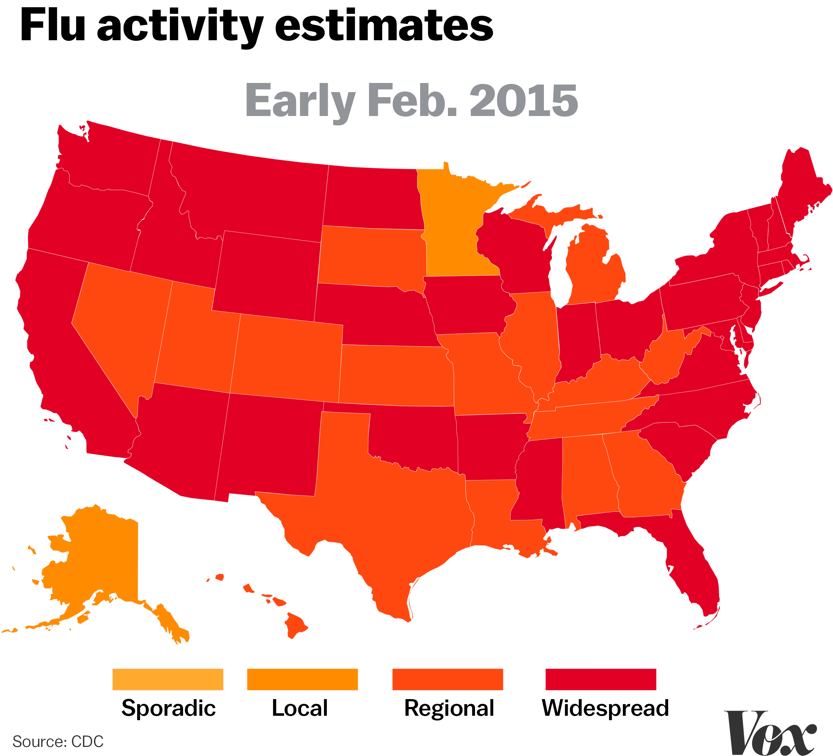
This year, the flu virus has been uncommonly widespread, wreaking havoc within the American population. For this reason, a dynamic map to compare the progression of the flu in the past few years is a useful diagram to illustrate the extent to which the flu virus has affected public health in the United States. As a rapidly evolving virus, the Class A strain of the flu is far more harmful than other flu strains. This map, created by the CDC, compares how this year’s flu relates to flu activity in past years. Through four separate images, the use of color marks the change over time and the extent of infection.
State political boundaries are included on the map. In order to demonstrate flu activity in each state, colors are associated with the extent of infection experienced by the state population. We typically associate colors like red, orange, and yellow with stop, danger, and caution. By using these colors to depict flu progression, the map uses color rhetorically to warn citizens and create a sense of fear that will encourage the public to make wise decisions about their own health/hygiene choices. However, isolating the flu outbreak with arbitrary state lines takes away from the map’s accuracy, permitting the idea that sickness throughout the country changes by crossing these arbitrary political borders. It is easy to assume from this map that in January of 2016, one could cross the state border from Virginia to West Virginia and decrease their risk of acquiring the flu. In reality, pockets of outbreaks are everywhere and cannot be looked at in a broad, statewide view. Taking the average of flu outbreaks over an arbitrarily determined domain takes away from the overall science of mapping disease. Another issue that arises from defining flu activity by state is that the map makes no reference to the underlying causes such as regional access to healthcare that influence the concentration of disease in a population. As a result, this map, just as any other map, has its limits.
The CDC map of flu activity in the United States has the primary goal of presenting clearly and concisely the change in flu activity from January of 2015 to January of 2018. Each state, while not labeled, is recognizable as an independent domain. Therefore, this map perpetuates the power and sovereignty of each state that makes up the United States. Also, in leaving out the names of the states and maintaining borders between states, one could argue this gives the states more power by assuming the reader is already familiar and in consensus with the territories drawn on the map. It is by this notion that someone could reference the fact that Oregon is the only state in which the flu is not as widespread as it is in the rest of the country this year. The assumption that the audience will recognize the state of Oregon without having to label the territory is further verification of the state’s sovereignty.
By projecting scientific data in this mapped form, the overall analysis reflects the author’s biases. This map could by no means be used for navigation around the United States because it has the specific goal of projecting the spread of the flu. Biases manifest through choices such as leaving states unlabeled, yet drawing borders and the density of infection aligned with color. The Centers for Disease Control and Prevention (CDC) is the United States’ primary federal institution entrusted with managing the outbreak of disease, gathering and analyzing disease, and uncovering disease origins. As the CDC is a highly respected scientific institution, the American audience is inclined to take this map as accurate and realistic to pathogenic events taking place throughout the country.
Overall, this dynamic map of flu activity is a highly persuasive tool, not only demonstrating the increased flu activity seen over four years, but also implicitly validating the United States’ domain in the world. This map works by creating a “healthy dose of fear” in the population, which makes sense, as it is the CDC’s job stay on top of public health issues in the United States. The bias in this map is more intentional than unintentional because in omitting such details like topography and not naming domains it stays focused on, which is warning the public of the growing health concern and implications of the flu virus. Ergo, this seemingly simple map of flu activity since 2015 reveals its underlying biases through rhetorical choices such as omission and inclusion just as any other map.
An interactive map is only appropriate to track the strains of the flu virus through the years. Each color changing map presents the flu in its varying forms to see how drastically flu activity has changed based on the time and intensity. It is interesting to discuss how the flu spreads between the borders of the map. By breaking the severity of the flu into sections by state, the map gives the vibe that some areas are safer than others. The map creates space that is dangerous and space that is safe. Abra discusses the limits of the map, which do not necessarily make it less accurate, but as a specific intent of the cartographer.
The idea that some states have less of a flu outbreak than others makes them more powerful. The audience wonders why a certain state has less of a flu outbreak. Could it be the land? Could the state be more sanitary? Do they have better healthcare and medication? I like how Abra described the biases of the cartographer by his choice not to draw borders and aligning the most infected states with darker color. The center of attention heads towards the darkest, and most contaminated states. The more hygenic states visually look cleaner by the lighter colors.
The problem and deceiving part of the map here is its association with the Centers for Disease Control and Prevention. I can see how people would perceive this map as accurate because they do not realize that the cartographer left out the influenza spreading throughout the states. Many maps are scientific, but I have not yet analyzed one that involves disease. I love how Abra exposed bias in the sciences. Most audiences of the maps would consider this to be accurate, especially with its association with the Center for Disease Control and Prevention. The map is accurate according to the cartographer. The map can only project a snapshot of the flu that spreads throughout the country. This interactive-biased map of flu influenza across the nation through the years grants the public safety information.
I really liked your map because it was the only one that was unique in its interactiveness. To add to that, I also really connected with your map because of the stark colors that connoted stark depictions of the flu across the United States of America, which is really unique because it is a country that does not associate itself with many famines and diseases.
To add to that, this map also displayed a great sense of transition and progression within a span of three years. Other maps did not display this, with most being single and still images, so again the notion of uniqueness really speaks true to why this map is so valuable.