
By: Sam Hyson and Evan Palmberg
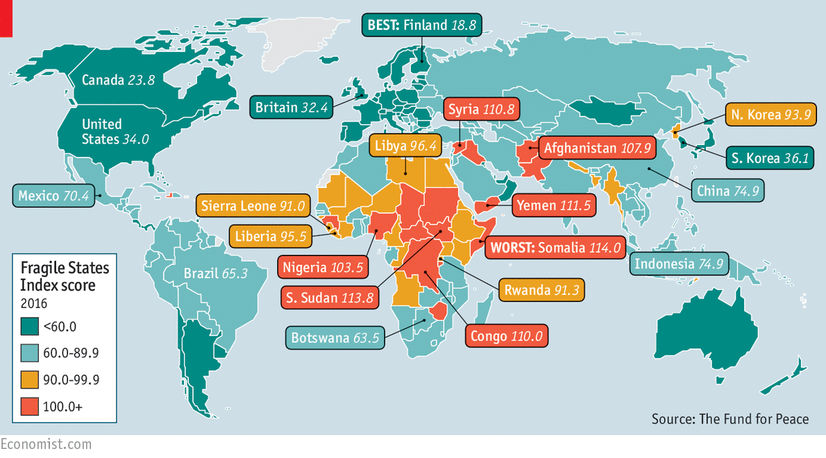
The Failed States Index map was first created in 2005 by the combination of the think tank Fund for Peace and the magazine Foreign Policy. The name was changed from the Failed States Index to Fragile States Index in 2014. The goal of the map is to assess a country’s vulnerability to collapsing. The map has been interactive in the past few years and contains an accompanying article with descriptions about why countries has changed in the rankings and what has caused these changes.
Links to 2016 and 2017 maps:
2016: http://foreignpolicy.com/fragile-states-index-2016-brexit-syria-refugee-europe-anti-migrant-boko-haram/
2017: http://fundforpeace.org/fsi/
In general, Scandinavian countries rank among least fragile states, along with countries like Canada and Australia. On the other end of the spectrum, the most fragile states often come from Eastern and Central Africa, as well as the Middle East. All of the countries are ranked on a scale from 0-120, with 120 being the maximum level of fragile a country can be. This 120 scale comes from a series of 12 indicators ranked out of 10, separated into three categories: social indicators, economic indicators, and political indicators.
While this map seem mathematical-based and unbiased, that is not the case. Since this map has been made by American companies, it has received critique for being biased, having flawed metrics, and failing to predict important events. Looking through the various years of maps, the argument can be made that these rankings are nicer to American allies, and more critical of America’s enemies, like North Korea. Additionally, this map does not reflect certain parts of countries that are either better or worse then the ranking for the entire country.
This map also brings up the discussion of what it means for a country to be a “failed” state. By calling a country a “failed” or “fragile” state, this may mislead policymakers to want to intervene in the country and help, when this may not always been necessary or the best course of action. Similarly, titling a country as “failed” presents a negative connotation to the rest of the world. This may have been part of the reason for the decision to change the name of the map. Calling a state “failed” creates the idea that a state is beyond saving, and there is nothing that can be done. Meanwhile, “fragile” causes people to think that there is still some hope for the country, but it needs to be done quick because the country is very susceptible to failing. This was a very important change that will hopefully lead to countries being further up the fragile states scale. While this map may seem simple at first, the connotation in its title and American bias that is presented creates critique about the Fragile States Index.
I found this map really interesting. I like that the map has a goal – it wasn’t just created to divide good countries and bad countries. I agree with you when you discuss the difference between a failed state and a fragile state. “Failed” definitely carries along negative connotations with it, and the makers of this map deserved to be critiqued and questioned when they changed the name of the map from “Failed States Index” to “Fragile States Index”. It would be interesting to see a government version of this map, one where the US government decides how countries rank on the 1-10 scale for each of the 12 categories instead of a private company.
For my team map presentation I also analyzed the Failed States Map, so I appreciate this different take and opinions on the map. What I thought was most interesting about this map is how certain countries had their index scores highlighted over others, because I feel that this choice by the cartographers allowed for the map’s audience to make easier comparisons between countries. I liked how you considered the bias instilled by the American companies behind the map, and distinguished the connotations of ‘failed’ and ‘fragile’. Overall, I think this map is fascinating and I believe that with increased circulation, it has the potential to become more widespread in our culture and have a serious impact on policy decisions.