
 Waking up Saturday morning to witness the greatness of The English Premier League is done by millions of Americans each and every week. For some it is somewhat of a religion, while for others it may just be a slight interest. But one thing is for sure, the Premier League is by far the world’s most popular and supported soccer competition. It is made up of twenty clubs per season that each play thirty-eight games and ultimately, the team with the most points is concluded the winner. While the Premier League is limited to clubs within the United Kingdom, thenumber of supporters outside of the UK’s borders is incredible. Not only has the league been the leader in TV viewers and fan support for several years, but the backing for every club is prevalent around the world. However, why do certain clubs have more support from North Americans than from South Americans? Why do certain clubs have such popularity in the United States? Questions like these are represented and answered by the Premier League follower map.
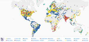
This map, produced by Twitter based on the locations of each of the twenty club’s Twitter followers, analyzes the popularity of each club throughout the world. While the stationary view of the map solely allows viewers to asses which clubs are most popular at a glance, the interactive map produced by Twitter allows for more in-depth examination with specific statistics and percentages. The first option presented is the “Find Your Club” function, which allows one to search for a specific club and view all of their supporters. Second, the map offers a “Compare” feature, in which one can select two clubs at once and view the support of solely the clubs selected. Third, a viewer can use the “Popular” feature to determine who the most popular clubs are in a certain area. In addition to these useful functions, the viewer of the map can drag their cursor over a country in order to see the top three most popular clubs and their percentage of support from that individual country.
By creating an interactive map in which viewers can change certain aspects, it allows for more of an understanding about the data. While viewing the changing colors in each region, viewers can comprehend that the loyalty to specific clubs may or may not rely on where they are located. In the form of a map, rather than a chart or data table, viewers are able to better experience and understand geographically where supporters live. With a map, the viewers are more interested in the data presented because instead of reading charts they are more involved in the examination.
In the creation of this map, there are certain things that were included that allow it to be much easier to view. Each country contains different colors, and each color represents a certain club. This allows viewers to glance at the map and clearly determine which club is the most popular in that country. Also, the map is centered on Europe, specifically on the United Kingdom. This makes sense because the majority of the supporters of the Premier League as a whole are from Europe, and lets the viewer of the map glance at every continent at once without any trouble.
With each continent and country having differences in their most popular clubs, the United States of America has an interesting range. The support from the United States is perfectly reflective of the premier league as a whole. The known “Big Four” of the Premier League -Arsenal, Chelsea, Manchester United, Liverpool- dominate the top four most popular clubs of the UnitedStates. At 21.08%, Arsenal tops the list, with Chelsea, Manchester United, and Liverpool following in that order. While looking at this map, it makes the viewer think about the relationship between British soccer clubs and American supporters. While millions view the Premier League matches every weekend, one may wonder why Americans support these certain clubs the most. It may just be that Americans only want to support the best clubs because in reality, not many people like supporting a losing club. However, the impact of advertisement and propaganda can also be discussed. In this league, clubs with the most amount of money are usually the most successful. With success in the league, the clubs are able to gain more support and bring in more income from TV contracts and advertisement deals, and in turn have more success as they can then buy better players from other clubs.
Twitter allows for the viewer to get a general idea of where loyalties lie, but is not completely accurate in the production of this map. While data is based on each club’s twitter followers, not every supporter of every club has a Twitter account or even follows their favored club if they do have an account. Thus, the representation cannot be fully trusted because of the lack of substantial evidence. However, with the data that was obtained, Twitter has created an easy and accessible platform for learning about the popularity throughout the world of English Premier League clubs. Now, the millions of viewers across the United States who spend their Saturday mornings watching their favored clubs can fully appreciate and understand the amount of support others also have for their club. Personally, as I wake up tomorrow morning I will be glad to know that there are thousands of others, 18.02% of the United States population to be exact, that are rooting for Manchester United alongside of me.
Sources:
https://interactive.twitter.com/premierleague/#?mode=team&teamId=all
Benjamin,
I like how you picked a map that showed your interest in soccer. What I thought was really cool about this map is that it is interactive and it comes from twitter. Most teenagers use twitter everyday but would never think of it as a reputable source for information about maps. I wonder if the projection of the map or any distortion played a role in making this map. I think particular map would be very useful to the audience that watches The Premier League or to any sports analysis. There does not seem like there is much bias in this map because it is based off of present human data however I am sure some of the data can be skewed. Anyways, good job, cool map!
Ellie
This is a really cool map! I particularly like how it’s interactive as these types of maps tend to show differences and similarities in trends of data much better and in more detail than typical, static maps. Additionally, this map can be seen as similar to the DSL map we have been working to design in class, and may even offer some useful ideas (such as the concept of shading certain areas within a country more heavily in order to show data distribution within that country). I also agree with your argument that the map may not accurately describe allegiance to certain teams, as not every fan may follow the team’s twitter handle and not every follower is necessarily a fan. Overall, a great map choice and analysis!
-Allison
Awesome Map, Awesome Writing, Awesome Person. Ben did a great job of picking a map that relates his personal interests to this class. I especially like the title it tied me right into the article and made me more interested in the blog post. The Map is very cool because it shows how popular soccer is around the world. The colors just pop out, and we can instantly see which areas support certain soccer teams. This map is for soccer fans all over and is a brilliant way for twitter to show it’s capabilities. Seeing this map really brought to my attention the data that is able to be compiled by social media apps. In conclusion this was a very good well thought out blog post.