
It is no secret that Americans love their food. The rise of the fast food industry in the 1950s tempted Americans with juicy hamburgers and crispy French fries. Consumer culture from the 1950s to the 1970s transformed processed foods like Oreos, Coke, and Ritz Crackers into hot commodities for both American and global buyers. Even today, new culinary movements have fueled the American foodie; sustainable eating encourages sourcing food organically and locally, and veganism has been mounting in popularity as dairy and meat alternatives become more accessible to consumers. In this sense, no matter how one looks at it, food has been and always will be a prime component of the American identity. But how do these gastronomical identities vary across state borders? Do many states share similarities in their culinary preferences, or are there typically regional or even state specialties? Jim Gaffigan’s Food Geography attempts to uncover the answers to these questions, with a bit of humor injected into his response.
Gaffigan’s map first manifests itself in one of his novels that is called Food: A Love Story. The book was published in 2015, and he addresses a variety of comical food dilemmas such as the inventions of coconut water and pretzel bread. Therefore, even with this slight context, it is not difficult to see that the map is designed to offer a chuckle to its audience. In addition, Gaffigan is not a cartographer; he is actually a comedian. This fact contradicts Americans’ typical perspectives on cartographers. Most often, we seek the input of experts when we scrutinize maps, for we put a colossal premium on maps’ accuracy. However, the recent mapping revolution has allowed all sorts of unexpected individuals such as Gaffigan to offer their very own contributions to the mapmaking scene.
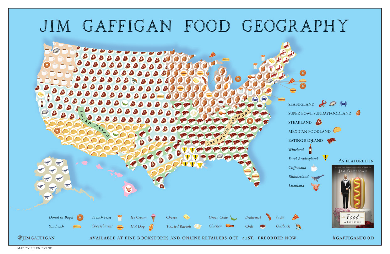
The map itself depicts just the United States, but the plethora of symbols makes it quite difficult to understand at first glance. Fortunately, Gaffigan provides a detailed legend. On a broader level, Gaffigan carves the country into regions according to the cuisine that is most prominent there. For instance, most of the southern United States from parts of Texas to Florida to Virginia is deemed EATING BBQLAND; this region is tastefully represented with an image of some baby back ribs. The southwestern states comprise MEXICAN FOODLAND with its telltale taco, stretching from Southern California to Austin, Texas. The Pacific Northwest is COFFEELAND, the Midwest shines in either STEAKLAND or SUPER BOWL SUNDAYFOODLAND, and Alaska holds its reigning title as the only state in BLUBBERLAND—of course depicted with a humpback whale. Louisiana is ambiguously deemed FOOD ANXIETYLAND with a large warning sign. In addition to providing symbols for each of these regions, Gaffigan also thoughtfully orders them by color to make even simpler distinctions between them. These examples affirm Dennis Wood’s notion that a map links a territory to what comes with it; this map illustrates what one would find in a particular region, conveying information that is more easily associated with that region when it is lined out on a map. Therefore, the map links a territory to the culture that is found there, such as the Midwest’s football fascination that bleeds into its unique cuisine.
Moreover, Gaffigan offers even more analysis into the United States’ culinary complexities by highlighting local specialties. A second legend at the bottom of the map exhibits these dishes, and it takes a bit of a keen eye to ascertain them on the map. New York City unsurprisingly yields to pizza and bagels. Cincinnati chili does not miss its opportunity to show itself off. Cheese, bratwurst, and hamburgers all find their niches in Wisconsin. Chicken, both hot and winged, comfortably hails from Tennessee and Buffalo, New York. Gaffigan even points out that the enigmatic toasted ravioli finds its origin in St. Louis. The map certainly does not appear to skimp out on Americans’ food favorites.
One significant fact to bring to light is that this map was designed by a comedian, not a cartographer. Gaffigan has his own intentions and interests to portray, but they differ significantly from what one might observe on a traditional map. For instance, this map’s primary purpose is entertainment. In essence, there is no true educational or intellectual objective in this map whatsoever. The map is not rooted in fact, and it is unlikely that any data was collected specifically for the fabrication of the map. However, it is much more likely that Gaffigan took his own observations of his surroundings and amalgamated them into a map for the purpose of comedy. He seeks to make people laugh with his work, whether that be by watching his shows, reading his novels, or examining his map. Additional scientific data certainly would do little to incite more laughter within his audience, so he opts blatantly to flaunt his opinions instead. Viewers understand that his work will inevitably have partiality injected into it, for he is a comedian who voices his opinions on and perception of the world. In this sense, maps can have objectives that are not necessarily educational—they may serve commercial, political, or even (as in this case) comedic purposes as chosen by the cartographer. This lack of intellectual origin does not make the maps any less prevalent, but it merely enables audiences to observe more unique perspectives on the world.
This map is also noteworthy because it deals heavily with notion of conventions and maps as social constructs. The beliefs reflected in the map are stereotypes; most Americans tend to accept these perspectives without a second thought. No one questions their validities, even if they know that the map may be extreme. This trust in these stereotypes stems from their roles as social constructs. They are simply norms in American society that have been present since citizens’ births. For instance, no one questions New York City’s reign as a pizza powerhouse, yet the delectable joints of Richmond, Virginia simply do not bear the same renown. By the same token, who says that San Diego is the only credible destination for fish tacos? Society shapes these views, making it nearly impossible for individuals to formulate their own opinions on local and regional delicacies. Yet individuals trust the map, for it affirms what the conventions have already established for them.
Still, these conventions hinder gastronomic diversity from materializing. The map only affords a surface-level depiction of American food culture. It neglects to recognize the incredible international cuisines that have made names for themselves across the country. Hawaiian poke bowls have taken California by storm. New York City offers any cuisine imaginable from Ethiopian to Lebanese to Brazilian. And who could forget about the dozens of Chinatowns across the country that greet consumers with a culinary journey to the Eastern Hemisphere? The map’s failure to emphasize these different cuisines constructs a gaping hole in the United States’ culinary culture; after all, in recent years, they certainly have secured a space right alongside hamburgers and macaroni and cheese in Americans’ palates. Instead, the map chooses to accentuate more “American” foods. Today, a true “American” cuisine consists of much more culinary diversity, despite what the map’s conventions may insist.
Finally, despite the lack of representation for the ever-growing international food scene, the map conveys an overall sense of nationalism. The map establishes regional and local cuisines as something of which Americans should be devoutly proud. It creates an identity around shared food culture. Furthermore, state borders are eliminated. In this sense, Gaffigan makes fewer distinctions between states, instead drawing comparisons on a more generalized scale. This tactic enables Americans to feel more connected to each other and more unified as a nation. Put simply, food brings people together.
In short, Jim Gaffigan’s Food Geography rallies Americans around some of their dearest treasures: pizza, coffee, barbecue, ice cream, and much more. Gaffigan’s comedic nature crafts the map into an article of entertainment as opposed to that of scholarly study. An academic map regarding gastronomical aspects of the United States would most likely focus on different forms of agriculture in each region. Or perhaps more credible cartographers would simply derive their legitimacy from concrete data that reveals which foods are consumed most often in different states. But nevertheless, with a cozy role in American culture, what is America without its food?
References:
“Food: A Love Story.” Jim Gaffigan. http://www.jimgaffigan.com/books/food-a-love-story. Accessed 28 September 2017.
“A Journey Through the History of American Food in 100 Bites.” The Salt. NPR, November 15, 2014.
Nora,
This map is so interesting! I can’t believe the map maker is not a cartographer but a comedian! However, I can’t agree more that people should be more open minded about cartographers, since this map both visually and textually meets the requirement for being geographically accurate and iconic. The map made by a comedian didn’t go astray from the purpose of cartography. Moreover, it provides us with a new perspective of how people see themselves from a map! Nice work!
Rong
Hi Nora,
Wow, this map immediately caught my eye when I first saw it! The comedic feature is definitely evident in the map–whether it’s through the symbols for the different types of food or the naming of each region. Food is definitely an identity for Americans these days, and it’s able to convey the culture aspect underlying food preferences; as you noted about the Wood idea, that a map links a territory to what comes with it. This is also evident in the fact that the food preferences on the map is divided into regions that we would usually divide America into: the South, the Northeast, and the Midwest etc. People with the same cultural backgrounds tend to share many similarities beyond that, and this map although might be subjected to certain stereotypes, is in fact illustrative of this concept. I especially enjoy your detailed observation and analysis of the map, such as the local specialties. I also agree that it would be helpful to include the growing favor for international cuisines, as it could also suggest the culture behind the pattern. Although this map is not necessarily scientific, it achieves its purpose of entertainment through the unique humor portrayed, and appeals to the readers’ sense of belonging while they explore the regions they are from. Thanks for sharing this map!
Nora,
I found this map to be comical an interesting. I love your take on the map and food in the United States. I also thought your analysis about cartographers was awesome. I really enjoyed how you talked about how the fact that he’s a comedian contradicts Americans’ usual perceptions of cartographers and how often we look for the knowledge of experts. This was a great choice for a map and I think you really did a thorough job in explaining the map and all of the different implications of it.
Nora,
You did a fantastic job of analyzing and critiquing with depth such a nontraditional map. I especially liked how you provided context for development of food in this country through the 20th century. You offered an interesting take in critiquing the map for making too broad generalizations, while also noting how this serves to bring people together in a sense. Your point of of the food diversity within New York City is especially well taken – it would be interesting to see what a more micro-level map of NYC would look like.