
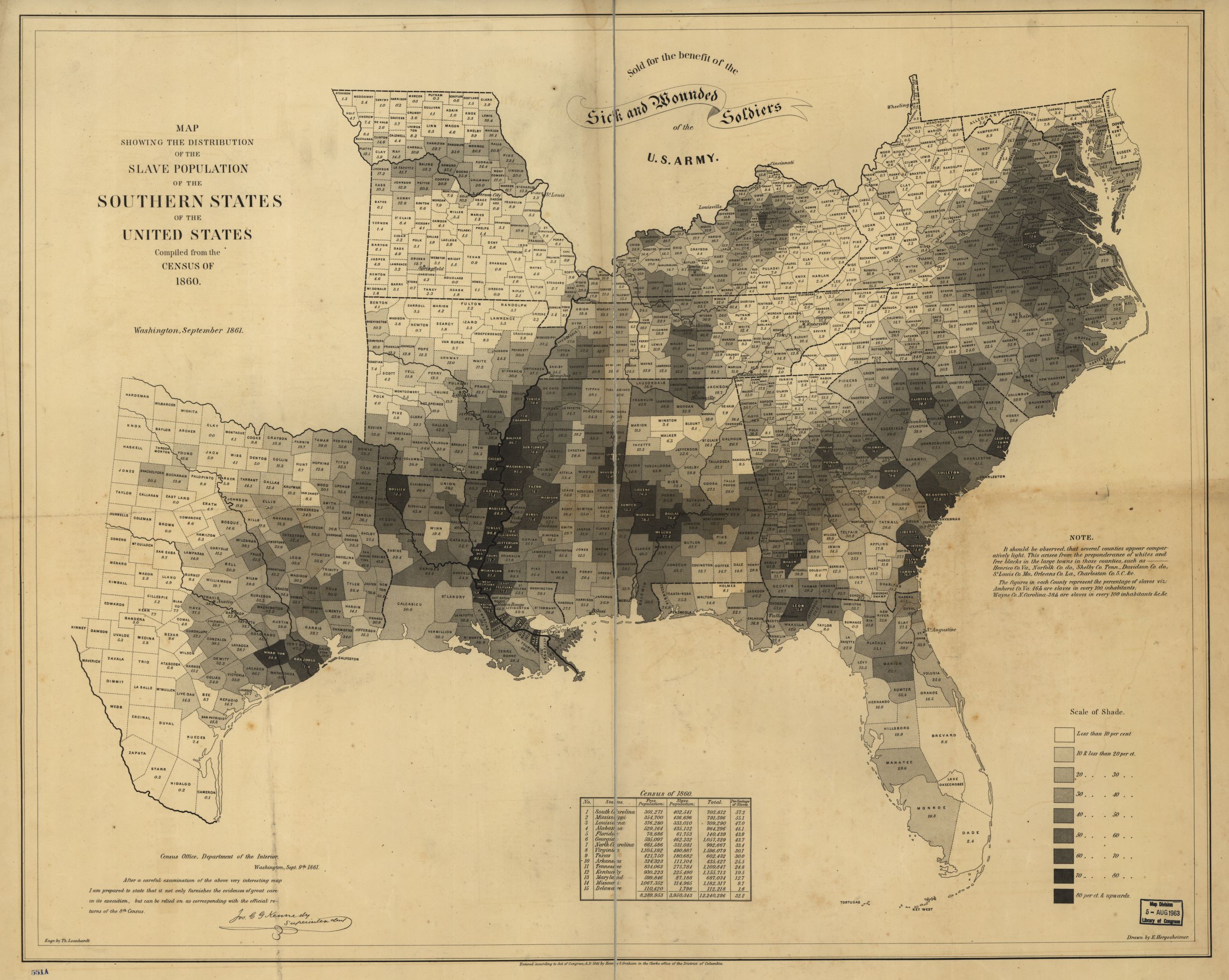
Does the appearance of a map reflect its true intentions? While I was searching for maps, I came across this map and perceived it as a scientific map. After further analysis of the propaganda found in the map, my initial perception was challenged. During the Civil War, one of the tensest times in the history of the United States, maps played a vital part in not only forming public opinion by use of propaganda, but also impacting presidential actions by appearing as factual pieces of war documentation. One specific map that was highly influential was Map Showing the Distribution of the Slave Population of the Southern States of the United States. I chose this map for the “Map of the Week” due to the fact that it was regarded as a highly scientific and statistical map, one of the first of its kind. As a result of the reputation of the map, it is rumored that Abraham Lincoln used this map in deciding where to send troops during the Civil War. This map can be interpreted as a piece of possible historical propaganda created by the Union in order to sway the politicians and citizens, as well as a statistical document. Does the fact that there is bias in this map detract from its objective merit?
In order to answer the question, this map must be explored and analyzed from various perspectives. The map was created by E. Hergesheimer, a cartographer with U.S. Coast Survey’s drawing division, who used data from the Census of 1860. He analyzed the population of various states and calculated the percentage of slaves per 100 inhabitants in each county. The map is color coded such that the areas with the highest percentage of slaves are darker than the regions with a lower percentage. The coloring is a clear decision by the map creator to indicate not only the large population of African Americans in the area, but also the danger that these areas could be to the union. The darkest areas can be found near Richmond, VA, the capital of the confederacy, and along the Mississippi River. The area near the Mississippi River contained an extensive amount of natural resources, and Richmond contained a large amount of influential members of the confederacy. The rhetorical choice by the author to solely include the South creates a separation of the union and the confederacy in a time where there was much division in the country.
The map was published in September of 1861. That September neutral Kentucky faced invasion by the confederates, and the Civil War was in full force. On the surface the map has scientific data to back up the statistics and even a disclaimer at the left bottom, which reads, “After a careful examination of the above interesting map I am prepared to state that it not only furnishes the evidence of great care in its execution, but can be relied on as corresponding with the official returns of the 8th census,” which is signed by Jos. C. G. Kennedy, Superintendent. Since the information on the map is verified by a Superintendent, one may assume that the map is not a propaganda map because of the stamp of authenticity from a figure in power, which plays a key role of in its rhetorical power. Someone who took this map as fact was Abraham Lincoln. It is rumored that the president looked at the map in deciding where to send union soldiers next. The power of this map not only comes from the data itself, but the verifiableness of the data as it was collected accurately enough for a superintendent to sign off on it. Additionally when authority figures rely on a set of data, the public wants to access this information as well, to get a glimpse into the mind of their leader. Additionally, the map was so influential that it was included in Francis Bicknell Carpenter’s painting First Reading of the Emancipation Proclamation of President Lincoln. The map is shown in the bottom right corner and is identifiable by the naked eye. This is just one testament to the power of maps, especially in wartime.
While Lincoln may have taken this map as fact, not fiction, there are certainly propaganda techniques used in the map. One defining feature of the map is the centered, bold text that reads, “Sold for the benefit of the Sick and Wounded Soldiers of the U.S. Army.” In the union states, citizens walking down the street purchased the map as an act of citizenship and patriotism during a war effort. One simple way to support a war effort is to buy goods that go towards soldiers or supplies. Those who did not enlist did anything that they could to contribute to their nation. If they read the map, they might be encouraged to support the union government in a more active way, besides just purchasing goods that go towards the war effort, such as housing slaves that fled the confederacy. This map could be considered a propaganda map for the union. It highlights the immorality of the south, as it showed how rampant slavery was in the confederacy. Many people in the union were appalled by the idea of slavery and this map, while based on statistics, played on the fears of the union government and its citizens. That said, the bias in the map does not take away from the factual nature of the map, it just gives spin on the map that made citizens more willing to support the union. It is rare to find a map that contains absolutely no bias. Mapmakers are people or organizations with their own opinions and views. This map is a great example of how a map can be factual and full of important statistics, and also contain bias in the reporting of these statistics and the presentation of the map.
References:
Carpenter, F. B. (1864). First Reading of the Emancipation Proclamation of President Lincoln [Painting found in U.S. Capitol]. Retrieved March 12, 2017, from https://www.senate.gov/artandhistory/art/common/image/Painting_33_00005.htm
Hergesheimer, E. (1861) Map showing the distribution of the slave population of the southern states of the United States Compiled from the census of 1860. Washington Henry S. Graham. [Map] Retrieved from the Library of Congress, https://www.loc.gov/item/ody0314/.
Mapping Slavery in the Nineteenth Century. (n.d.). Mapping Slavery in the Nineteenth Century. Retrieved March 12, 2017, from https://www.nauticalcharts.noaa.gov/history/CivilWar/docs/Slave_Density_Map.pdf
I really appreciated how Maddie compared the map with how it was viewed historically by political leaders of the United States of America to how we should view the map with the critique in mind. It is really important to look at how it was used by President Lincoln during the civil war because it shows the historical background of the map and gives an explanation to how this map was used during the civil war. It is also important to note that while this map was viewed scientifically, there was actually a lot of biases represented in this map. It has a bias towards more active support from the union effort to help the slaves in a more active way. This map also shows the union how unjust the confederacy by the sheer amount of slaves that they have. This blog post also points out how a map can be factual and contain biases. It calls to question whether we can trust a map with biases, and Maddie proves that a map can still have truth to it and be extremely useful, even if we should be cautious while viewing this map.
When I first signed up for this class, I thought that Westward expansion and the 1800’s would be a major part of the class. In terms of American geographical growth, I feel like this period was one of rapid change, and therefore the maps that were produced during this time period would be an interesting reflection of that change. This map reminds me of the cartographic tools used to justify violence and discrimination against the native Americans. I think the most interesting aspect of this map is its audience. It ranged from the President of the United States, a lawyer who was natural analytic, to common citizens purchasing the map in order to support the war effort. I studied the Census in my sociology class and the politics behind it are much greater than meets the eye. I really liked your analyzation of where the data comes from and it is very telling of the role the US Census has to play in American geopolitical life.